
Slifer Smith & Frampton
COLORADO CALLING.
Slifer Smith & Frampton's origin story is deeply rooted in Vail’s ski community, a place the three founders had dedicated their lives and careers to, but they had expanded far beyond Vail to markets encompassing Aspen all the way to Boulder. We developed the Colorado Calling brand mantra to build a campaign that not only acknowledged their expanded footprint but showcased the vibrancy of the culture present within the company.
C R E D I T
Creative Agency: 1000watt | Creative Direction: Patrick Sanders | Design: India Myers | Writing: Jessica Swesey & Mike McCoy | Photography: Rebecca Stumpf & AJ Canaria | Web Development: Timothy Decker
Creative Agency: 1000watt | Creative Direction: Patrick Sanders | Design: India Myers | Writing: Jessica Swesey & Mike McCoy | Photography: Rebecca Stumpf & AJ Canaria | Web Development: Timothy Decker
Colorado's real estate company
A big part of our charge was to help Slifer Smith & Frampton shed the identity of being just a “Vail company” as their footprint had grown far beyond. The strategy became one of owning their place as “Colorado’s real estate company” and letting the world.
This work led to the brand mantra, Colorado Calling, a simple articulation of the emotional connection to people, place and purpose that sit at the heart of the Slifer Smith & Frampton’ brand. To carry this forward, we crafted six brand principles that serve as the non-negotiables that guide everything they do.

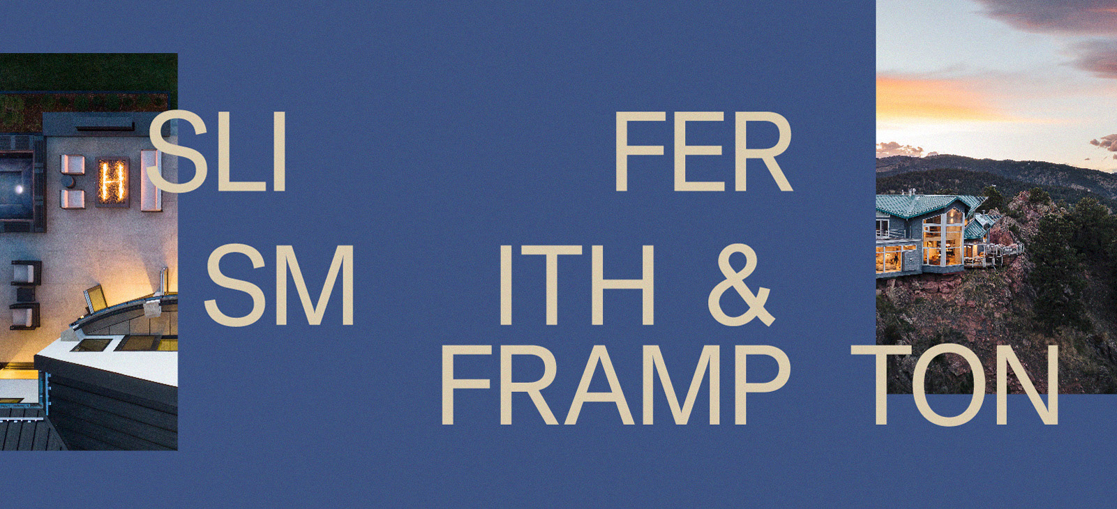
Colors of Colorado
In pursuit of being seen as a Colorado company and not just a Vail company, we expanded the color palette to reflect more regional influence. Natural and regal, the colors provide a range of tones that elevate the campaign.
Icon as frame
Inspired by the three bars in the Slifer Smith & Frampton logo, we developed a visual system that would set the stage for every narrative to play out — ensuring consistency and reinforcing their brand in fresh new ways.
The framing convention was designed to be implemented in countless ways. Changing the orientation and sizing allowing the system to perform in every medium and channel.


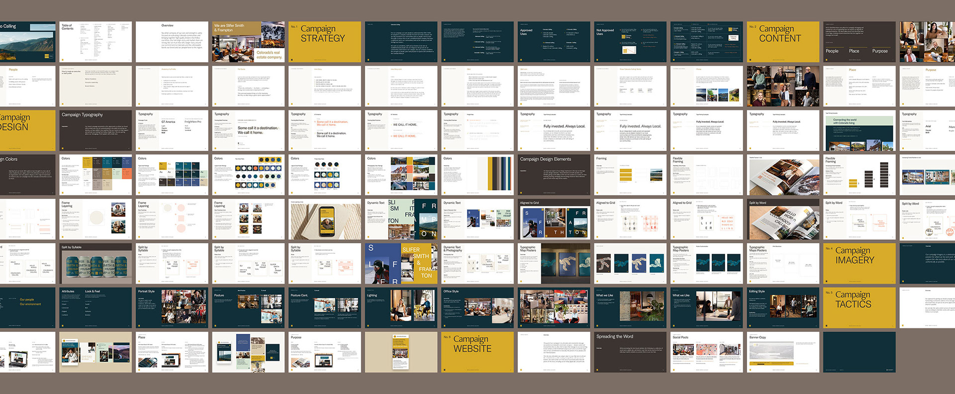
Leveraging the name
Another important consideration of the campaign was how we would leverage the company name. A bit of a mouthful, Slifer Smith & Frampton felt like it demanded to have a bit of fun to accurately represent the people that make up its team. With this in mind, we introduced a dynamic, expressive type within the system.


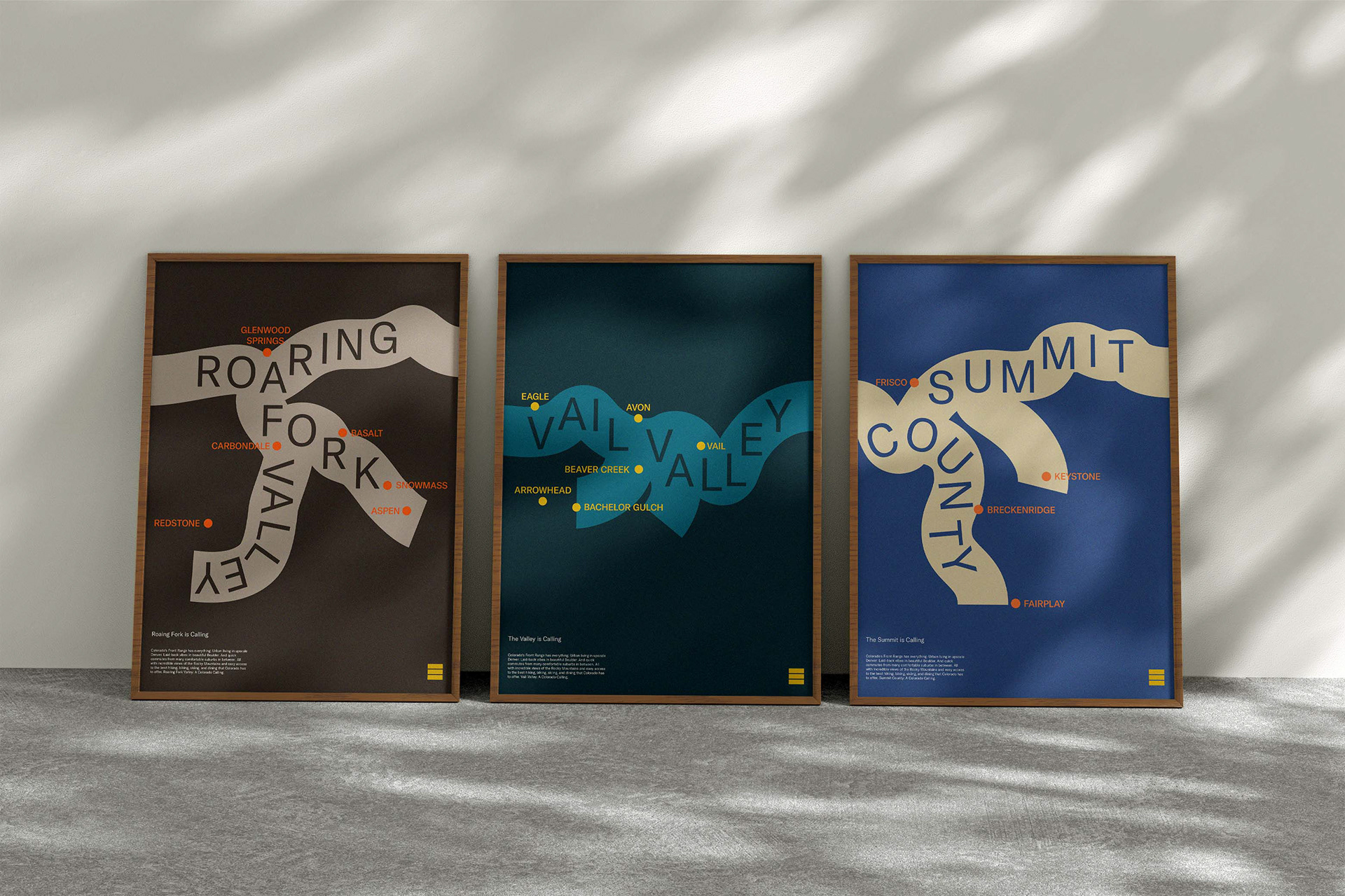
Typographic maps
To further celebrate Colorado, we expanded on the dynamic type system to create typographic maps that boldly showcase the new color palette and demonstrate Slifer Smith and Frampton’s reach and influence.
An emphasis on people
The people at Slifer Smith & Frampton embody the brand’s values and Colorado Calling while being stewards of it. To carry forward the theme of Colorado Calling further within the campaign, we worked with two local Colorado photographers to photograph the Slifer Smith & Frampton team in their environment. To help keep the style consistent between the two photographers, I developed a photoshoot brief and photography style guide.


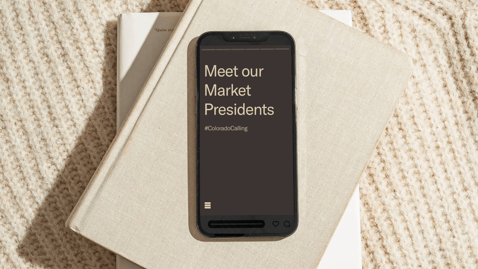
One website to unite the entire campaign
After the content strategy and copy were developed for the brand campaign website I began on the visual design. The site’s purpose is to tell the company’s story, feature its people prominently, and reveal more of its core purpose and strong connection to Colorado to both brokers and consumers in the region.

Brand campaign guidelines
As the engagement came to a close, I built out 100+ page guidelines. Developing rules and restrictions to serve as a guide and map for future deliverables.