
Sereno
Imagining a better community.
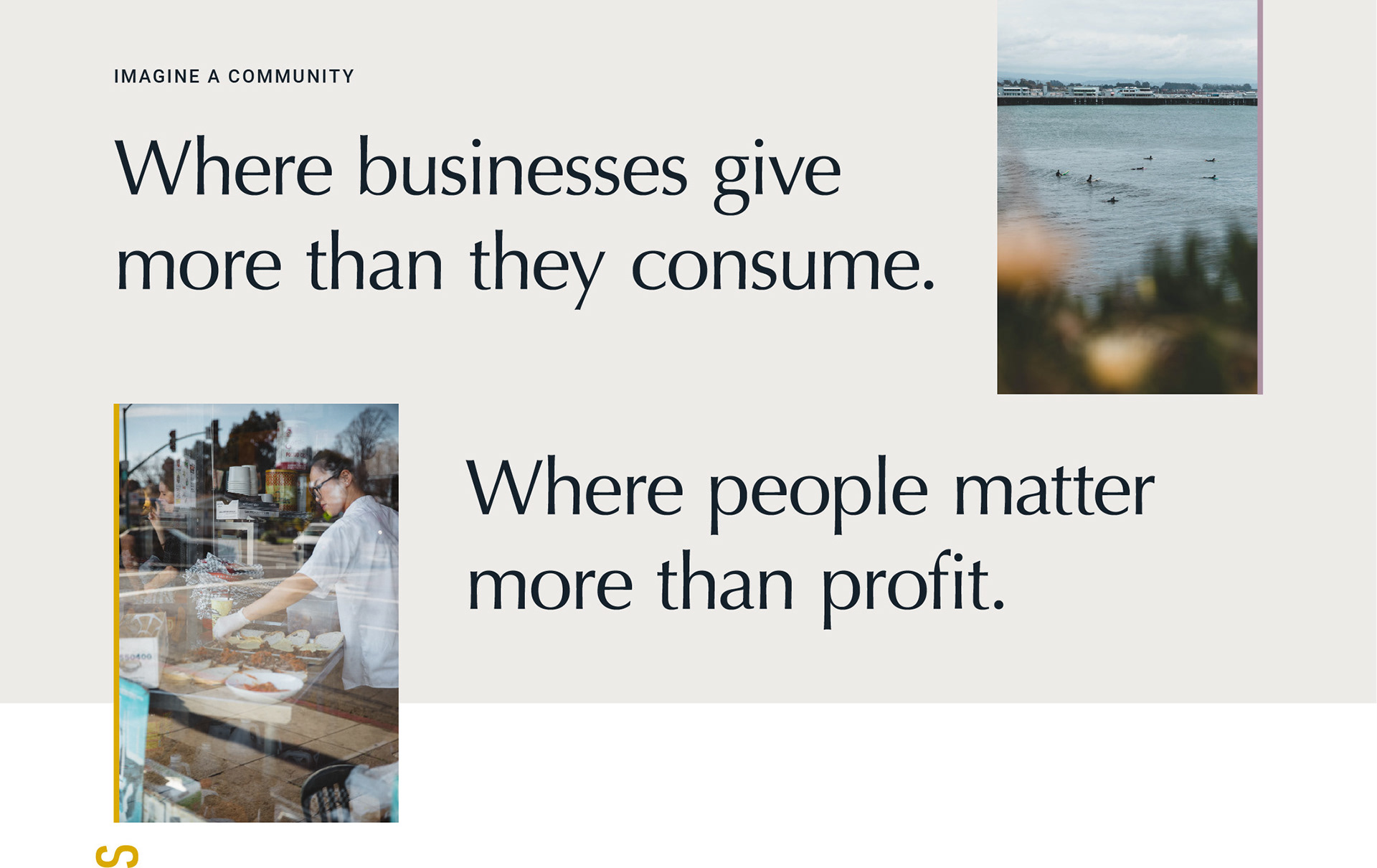
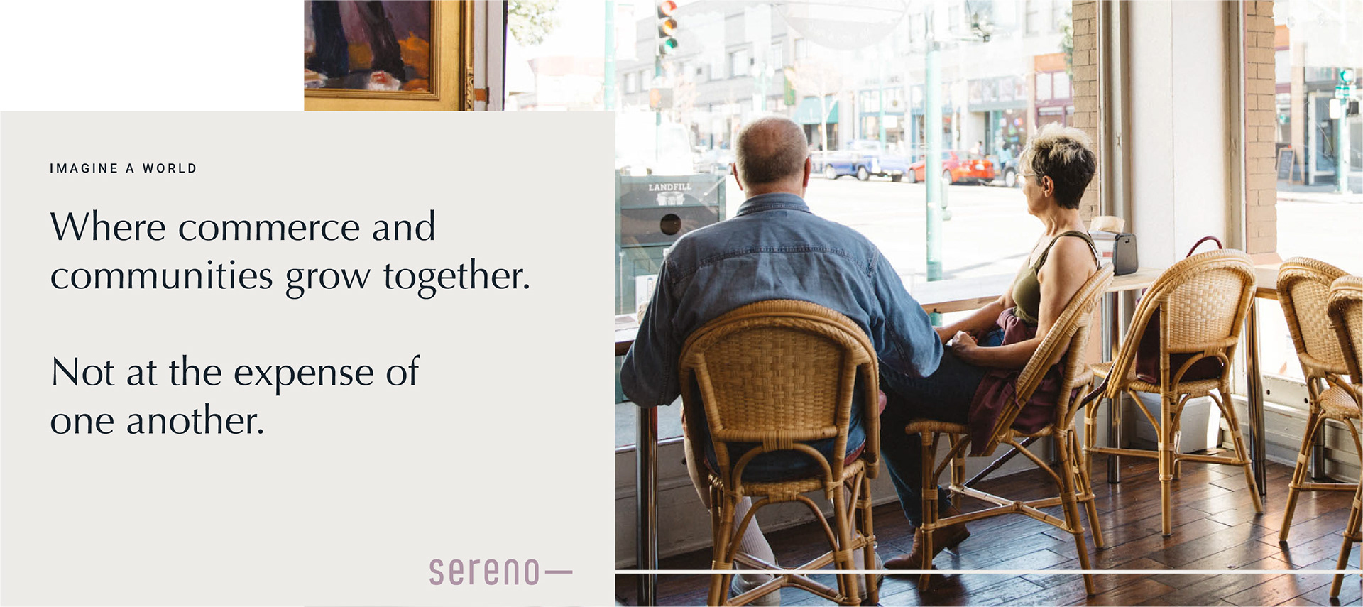
Sereno had always led with mission and heart in the fiercely competitive Northern California real estate market. Having recently acquired a competitor and facing intense challenges from venture-backed companies, it was time to take the brand to the next level.
C R E D I T
Creative Agency: 1000watt | Creative Direction: Patrick Sanders | Design: India Myers | Writing: Jessica Swesey
Perspective & vision
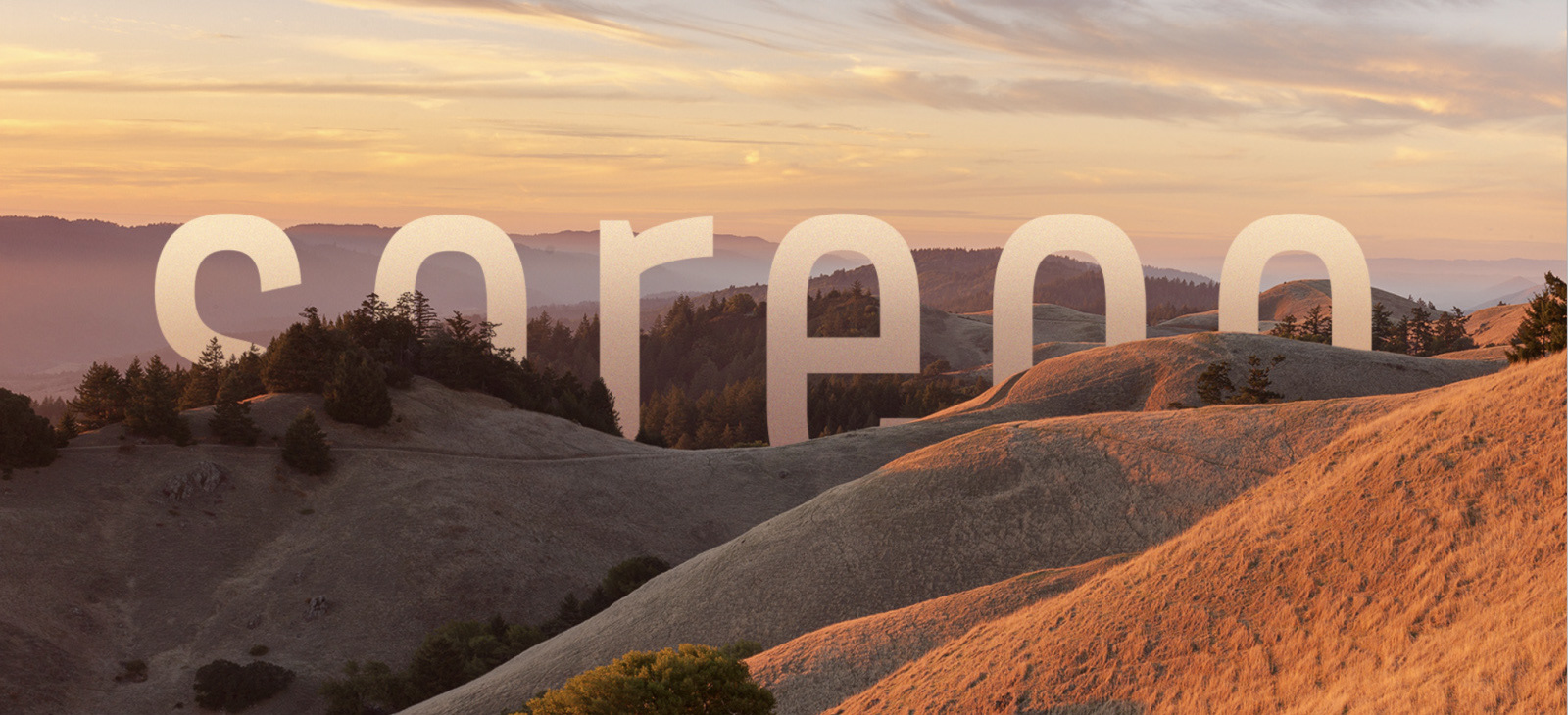
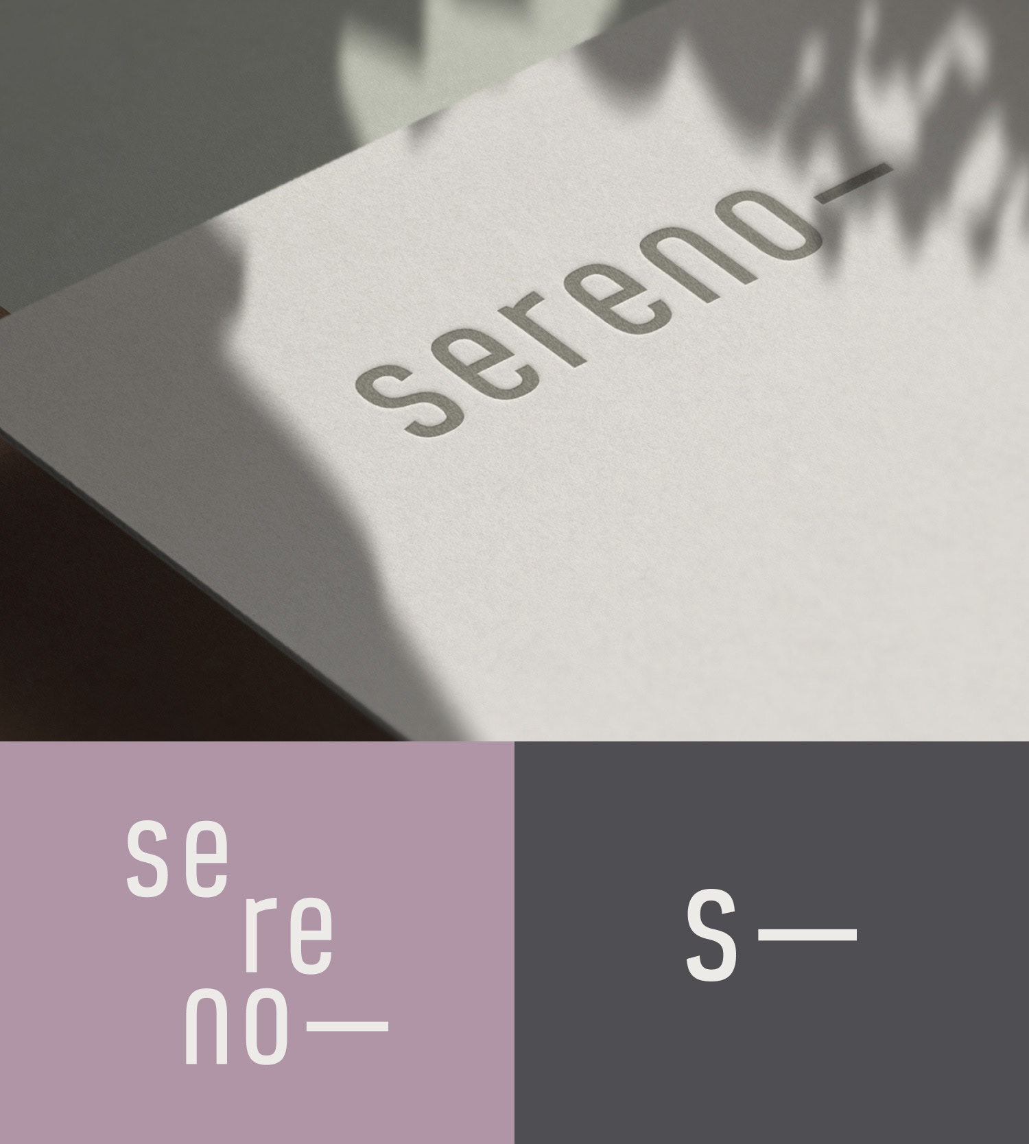
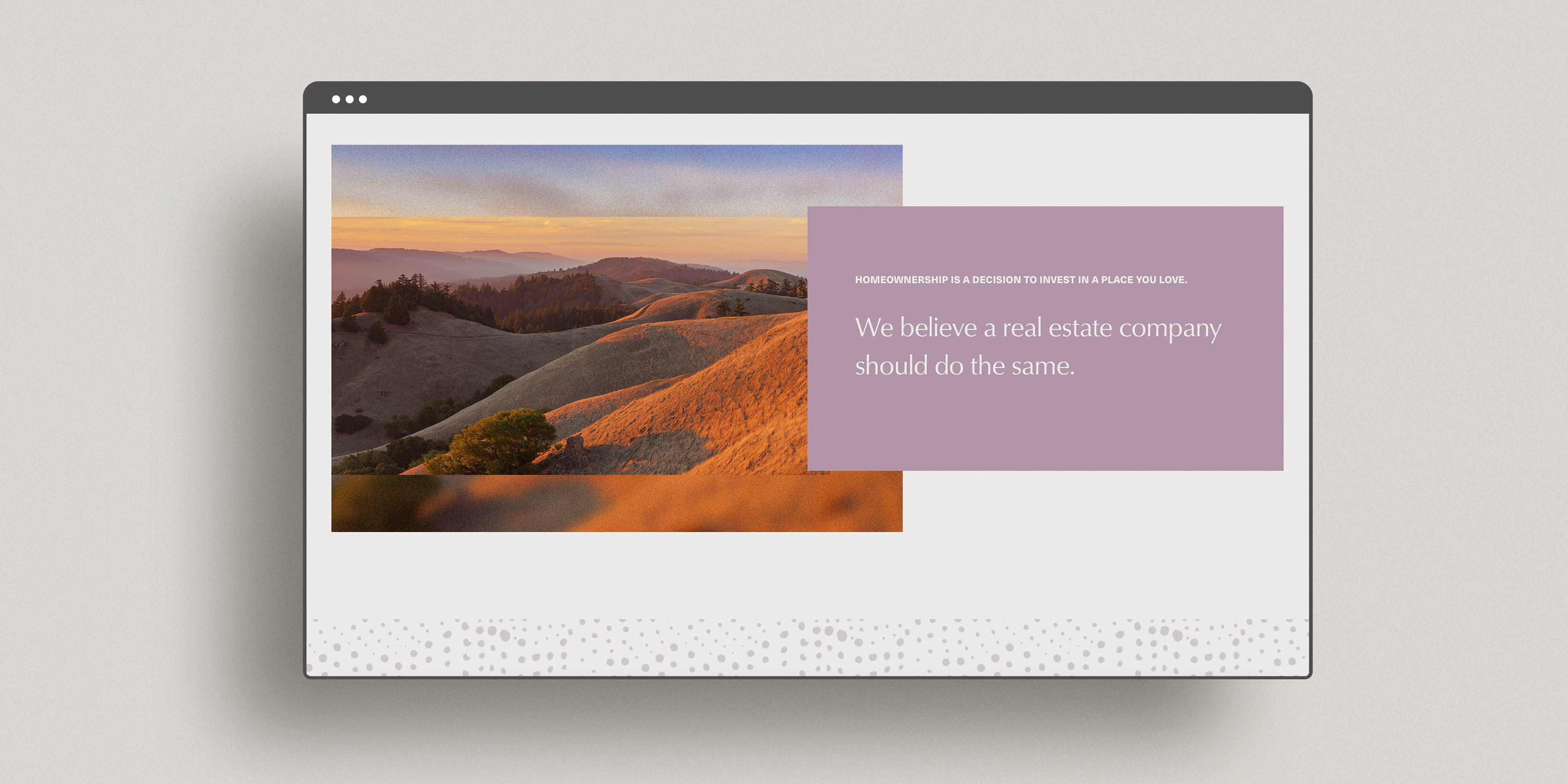
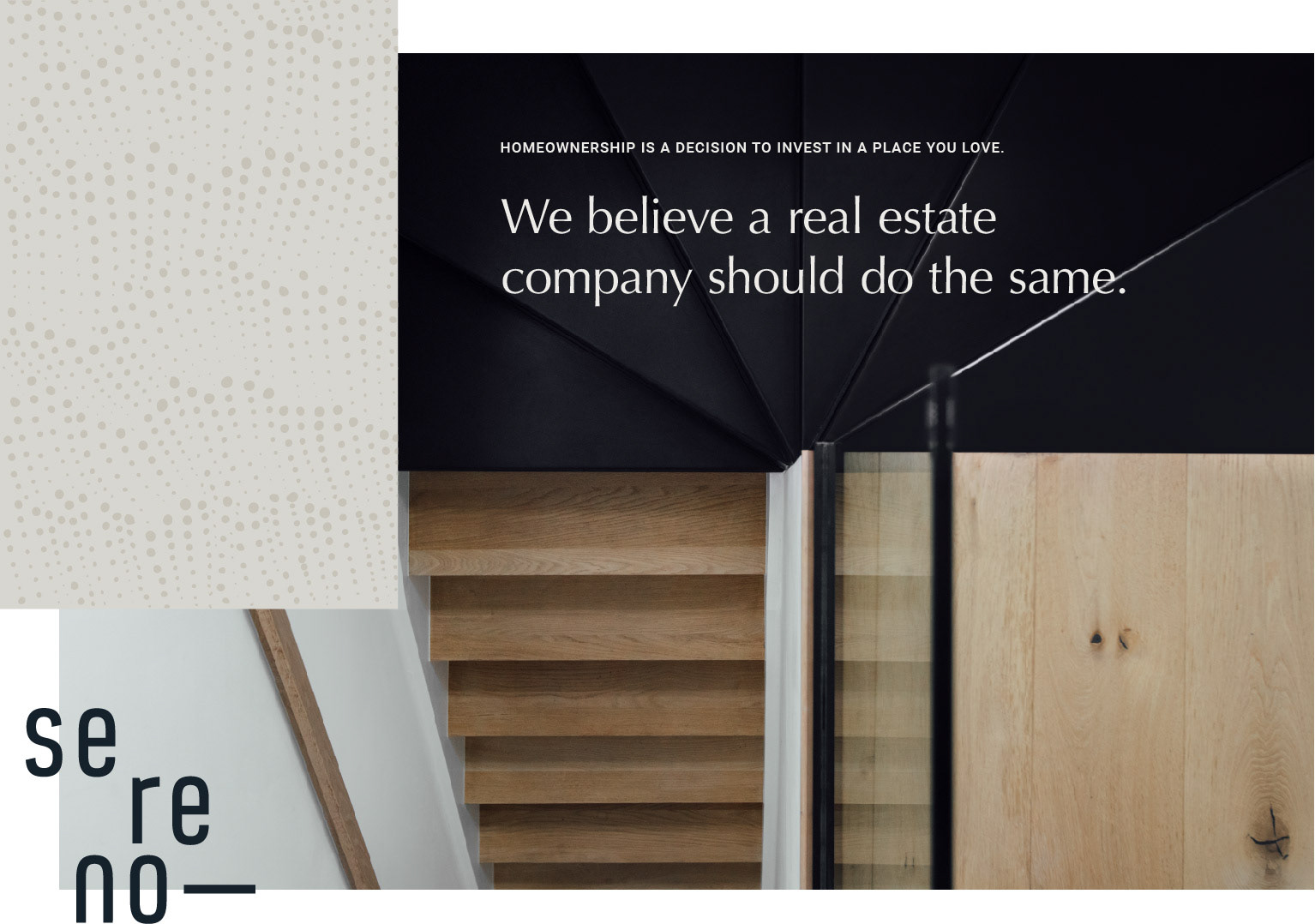
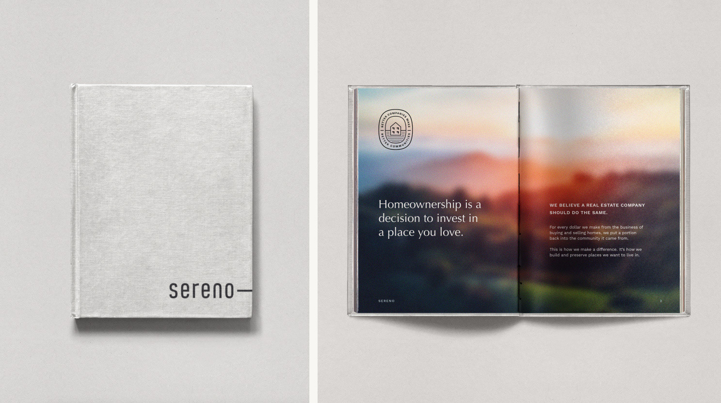
In a region and market defined by change, Sereno stood as constant at the horizon line, offering a different perspective on what a real estate company could be. I worked with the creative director to build this notion into the very foundation of their new identity.

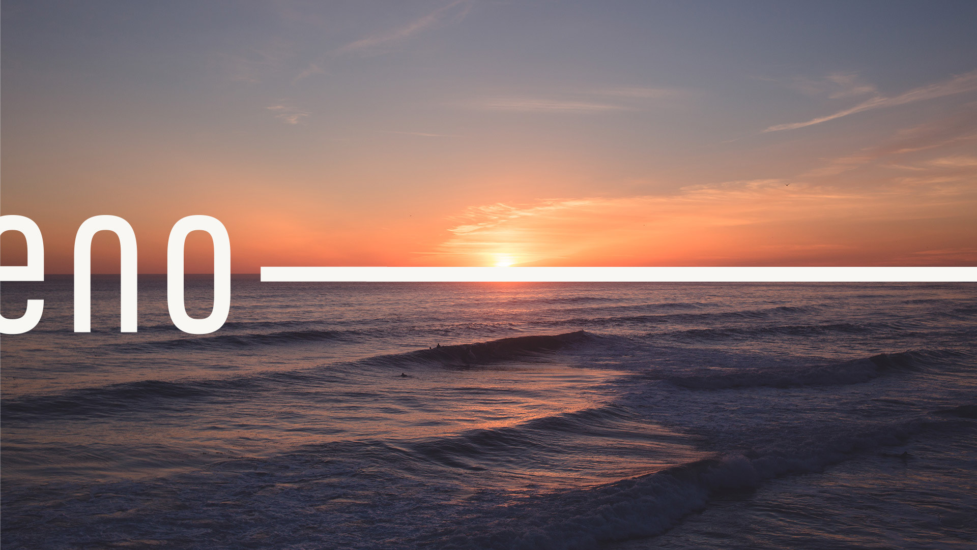
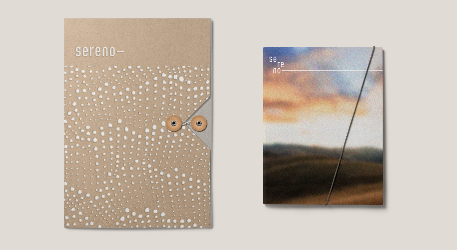
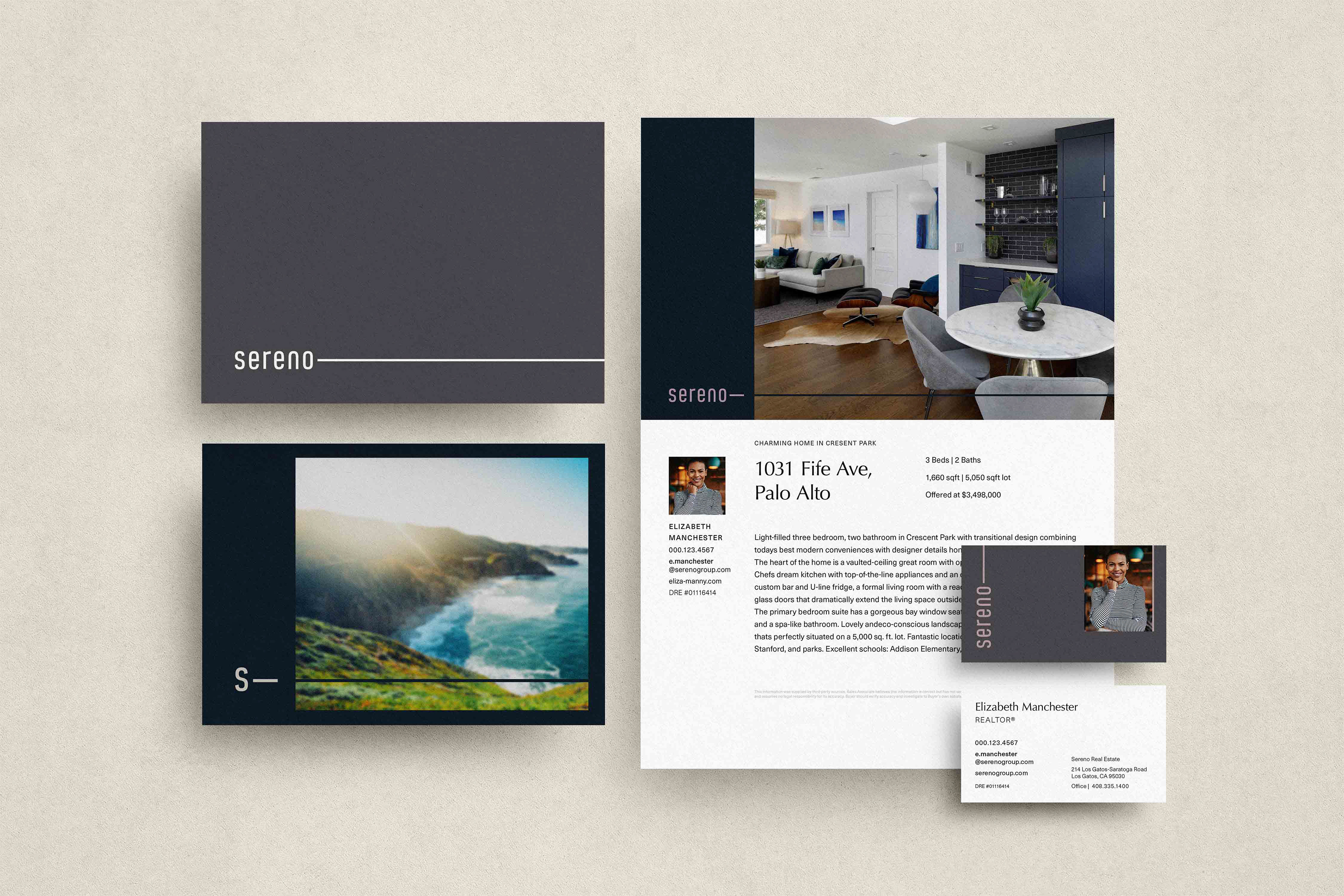
The horizon line built within the Sereno logo perfectly bisects the word mark, helping to balance its asymmetry. The horizon line can extend infinitely to the right to reinforce the idea of possibility and balance.
Nostalgia as a conceptual driver
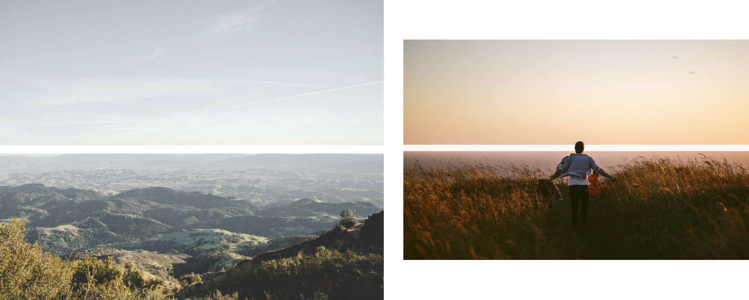
The idea of nostalgia surfaced in our discussions with Sereno’s founders, who held to a community-focused vision. We reflected this in both copy and imagery.
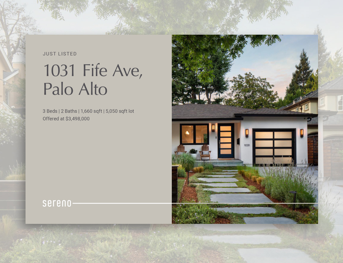
A brand that identified so deeply with the communities it served had to reflect a sense of place everywhere. The color palette was drawn from the local Northern California landscape to reinforce this idea.
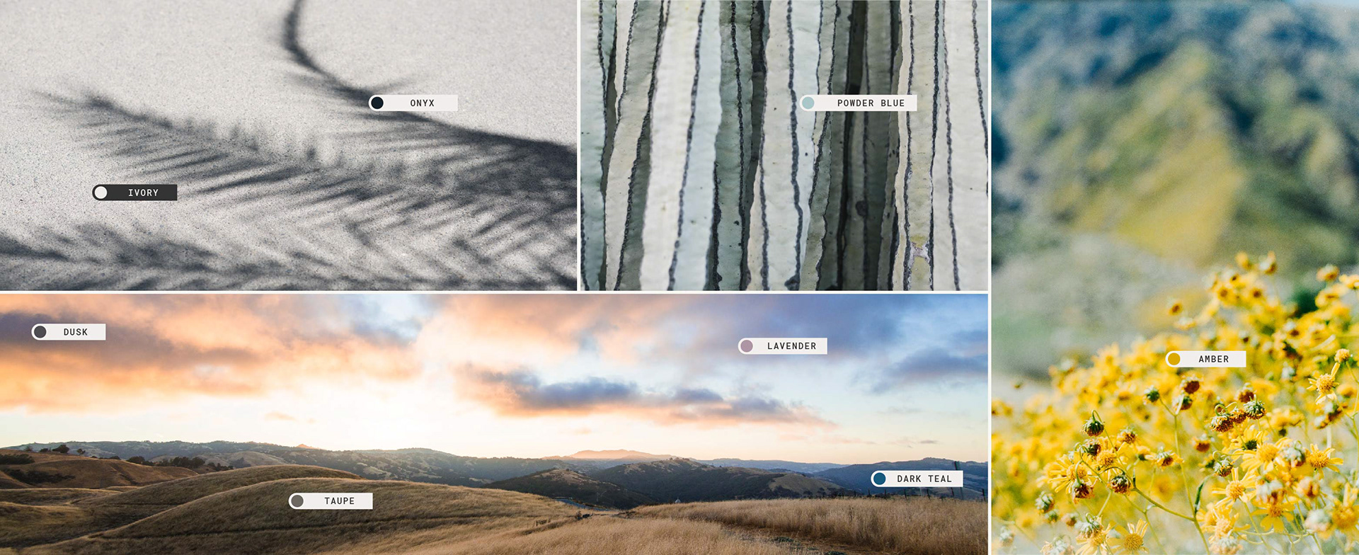
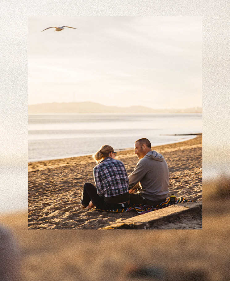
Photo textures
One of the more unconventional and inspired moments of the identity system took form around what we call Photographic Textures. As we considered the theme of nostalgia from our creative brief, and the way we might bring imagery to life through this lens, we developed a custom effect that renders photography in the same way a slide projector would cast family photos on the walls of our childhood homes.
What we assert with this approach is that it isn’t the crisp fidelity of a high-resolution image nor a perfectly calibrated color frequency that connects with our memories, instead, it’s the emotional imprint those memories made on us that occupy a special place in our minds and hearts.
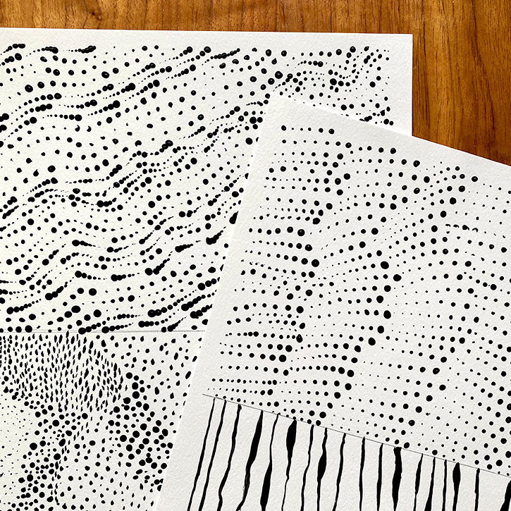
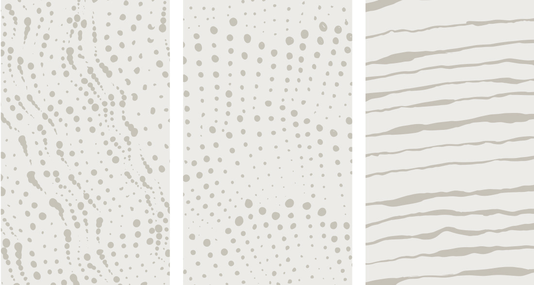
Handcrafted elements
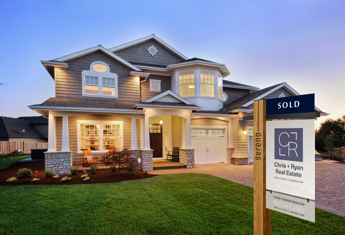
I personally created hand-painted elements named contours that served as abstract interpretations of the regional landscape. These motifs became an integral part of the visual system, touching everything from the company website to yard signs.
Taking the past into the future
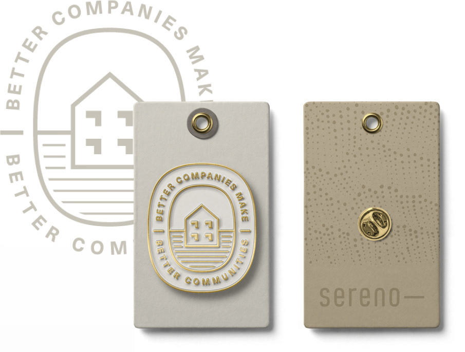
Sereno’s old logo was a simple yet evocative illustration of a house many in the company had a lasting connection with. We wanted to honor this old mark, so I reimagined it in the form of an “Heirloom” that would serve as a mark of pride within the company.
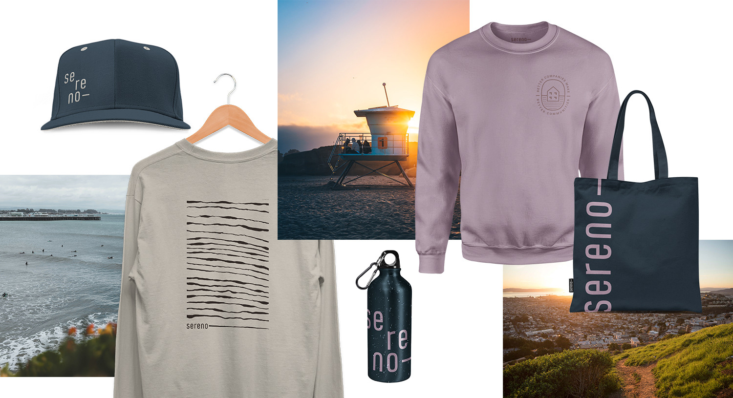
As we considered how to bring the brand to life through apparel, we imagined how one would wear the brand. We established a brand vibe that felt relaxed and at home within the beachy communities it lives and serves.
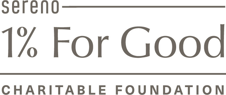
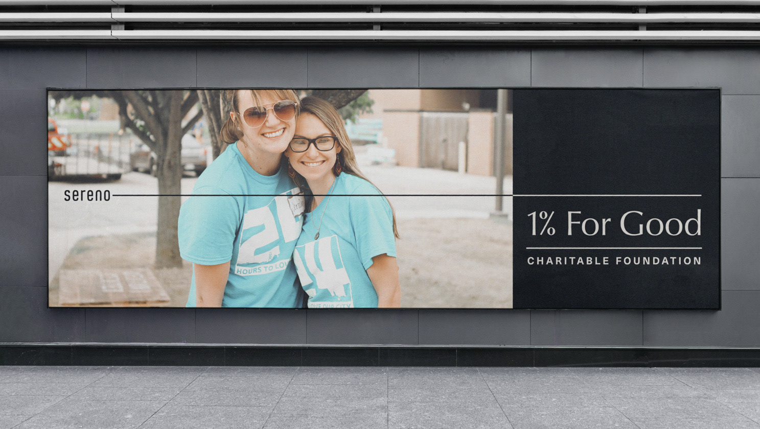
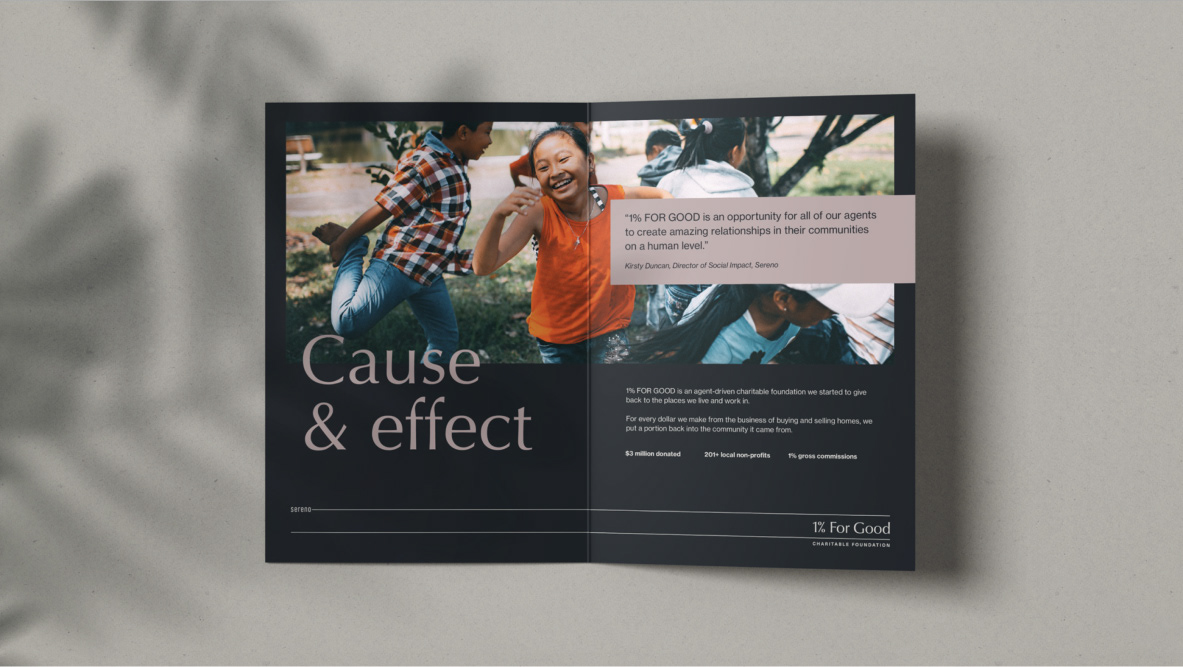
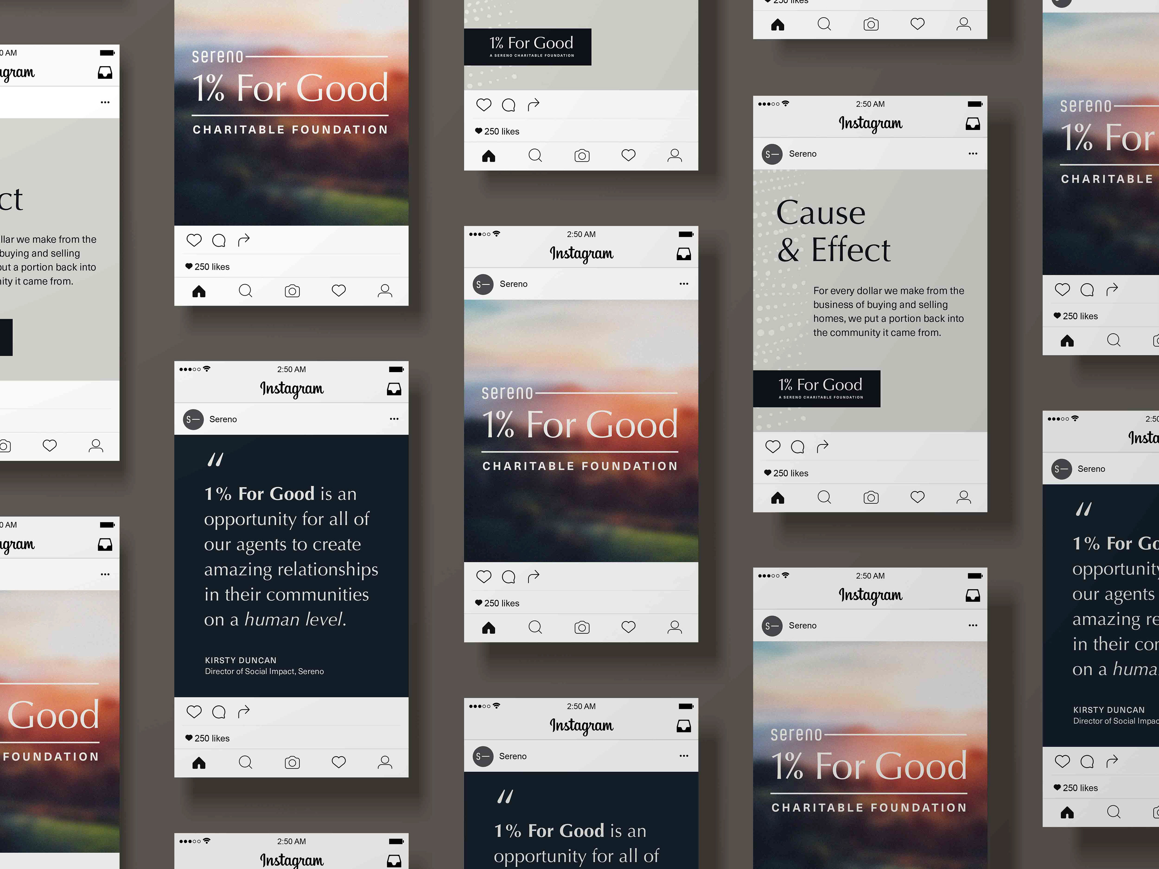
1% For Good
Since its founding, Sereno has committed a portion of its profits to investment in the communities it served. In recognition of this, I developed a new logo for their 1% for Good foundation to tie into the new brand identity.