
Morley
HERe FOR GOOD.
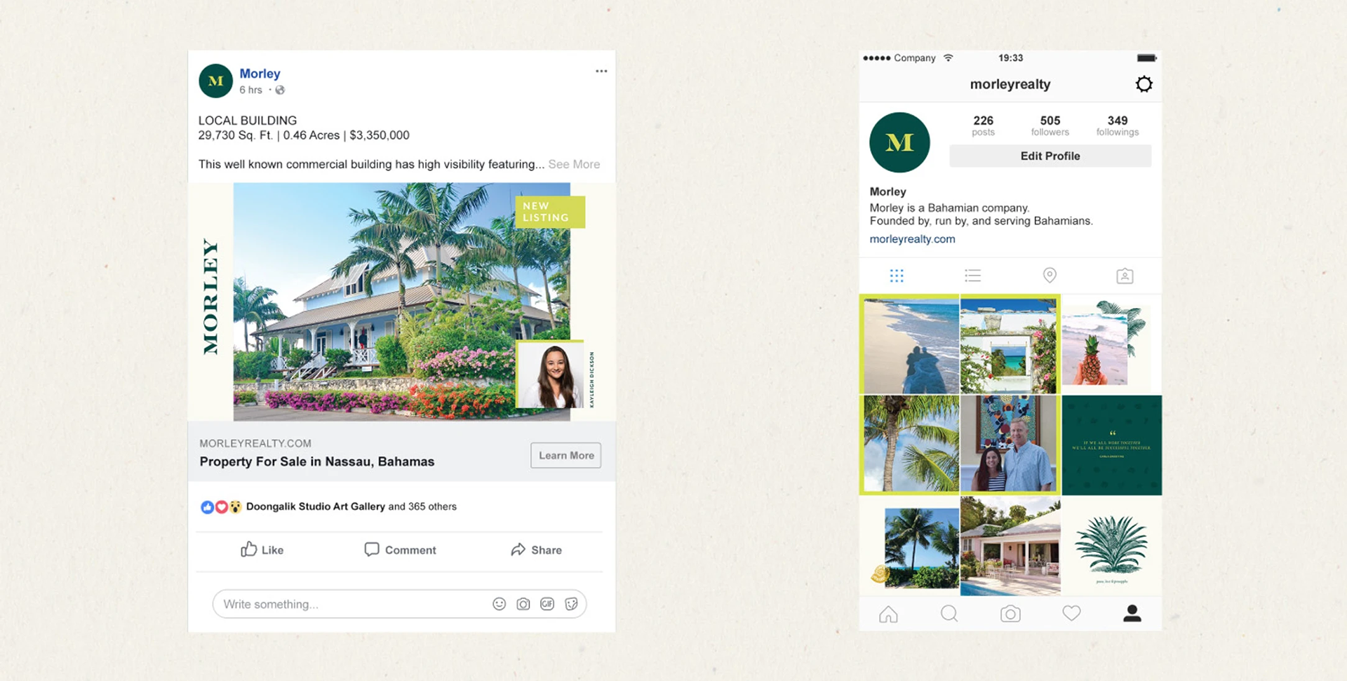
Morley is a local Bahamian company and a household name in commercial real estate that needed to establish itself in a competitive residential market.
C r e d I t
Creative Agency: 1000watt | Creative Direction: Patrick Sanders | Design: India Myers | Strategy: Corina Allender | Writing: Darcy Walker
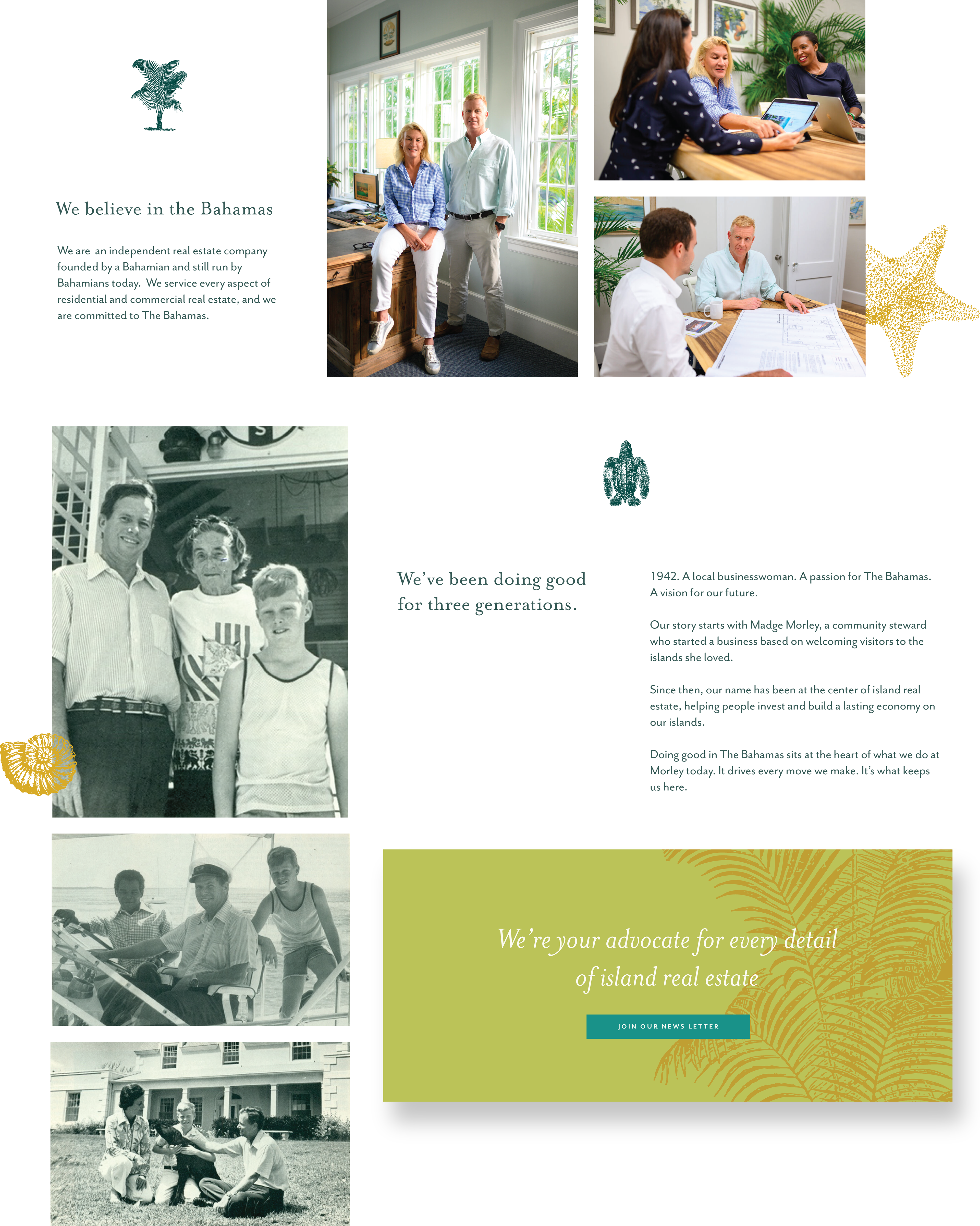
The Morley family has been a local name in Bahamian real estate since 1942, playing an integral role in the commercial development of the islands. When they opened up a residential division, they needed help to re-establish their name as an expert in a new space. As a member of the 1000watt team, I worked alongside the strategist and copywriter to dive deep into the brand's heritage and develop a brand and identity that showcased the company's roots and set them up for the future.
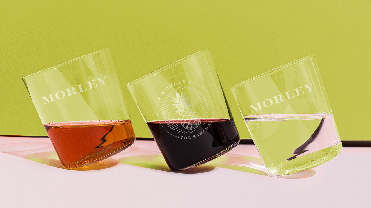
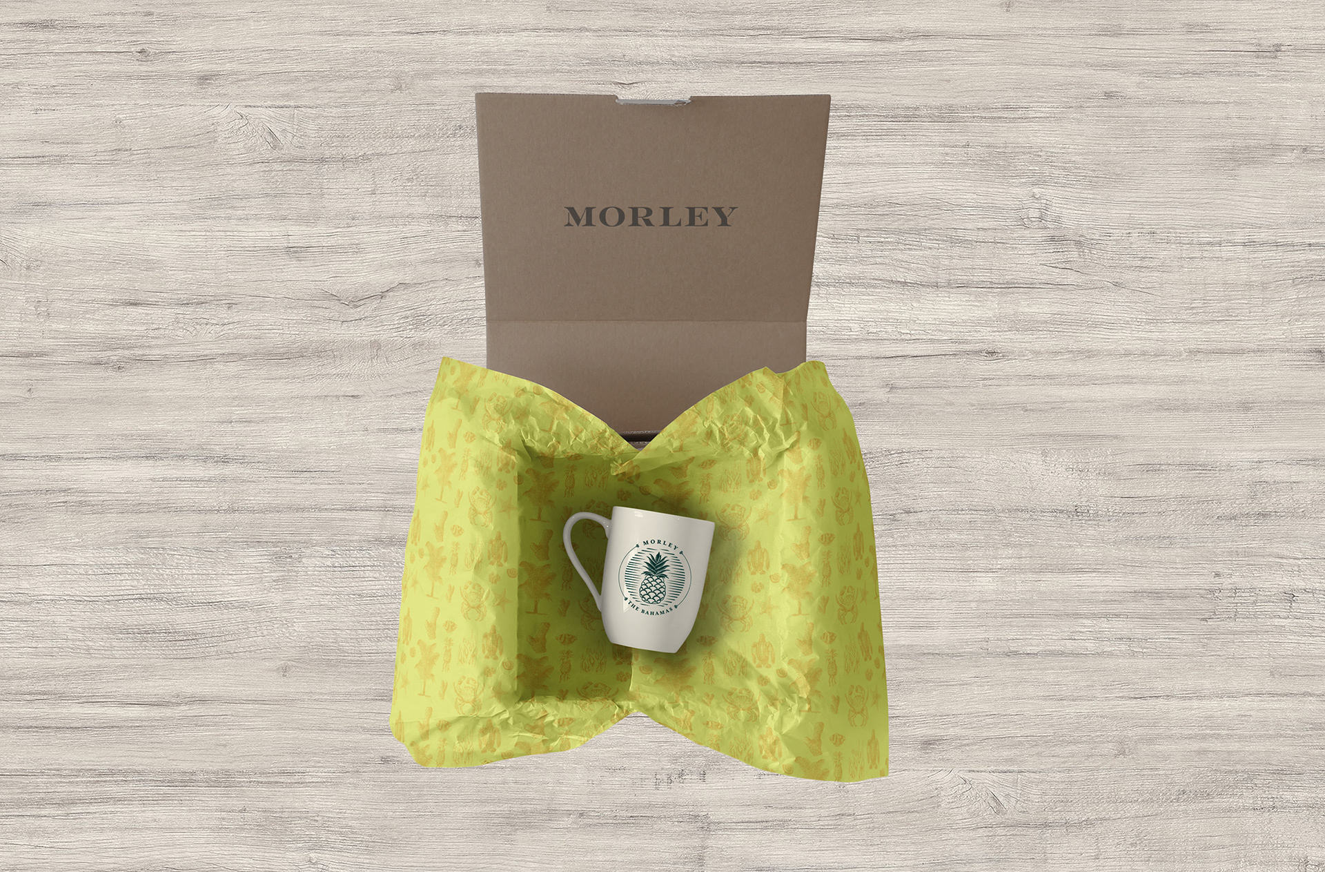
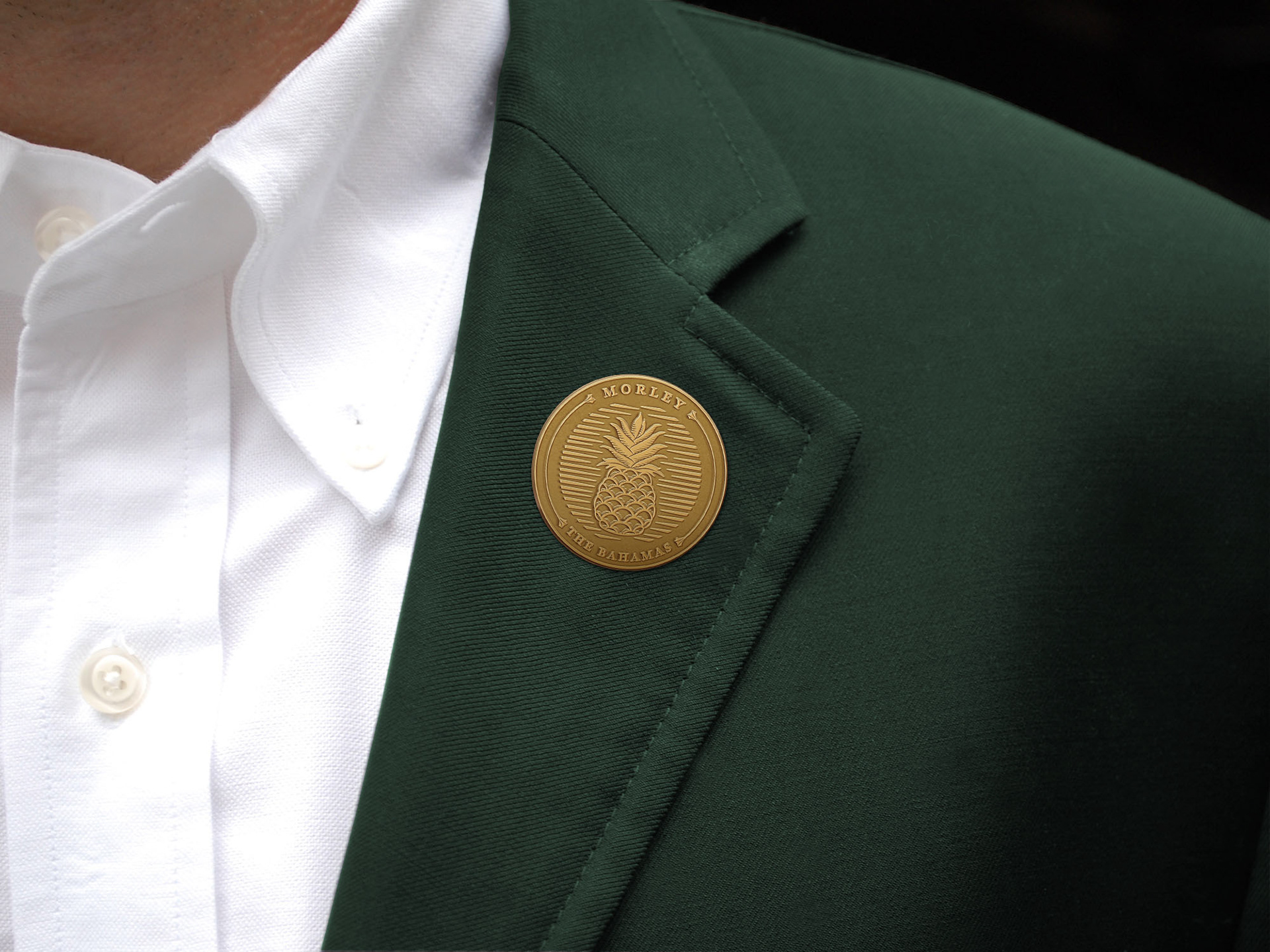
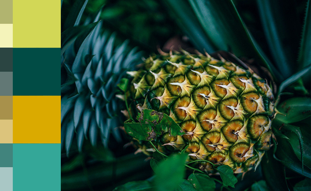
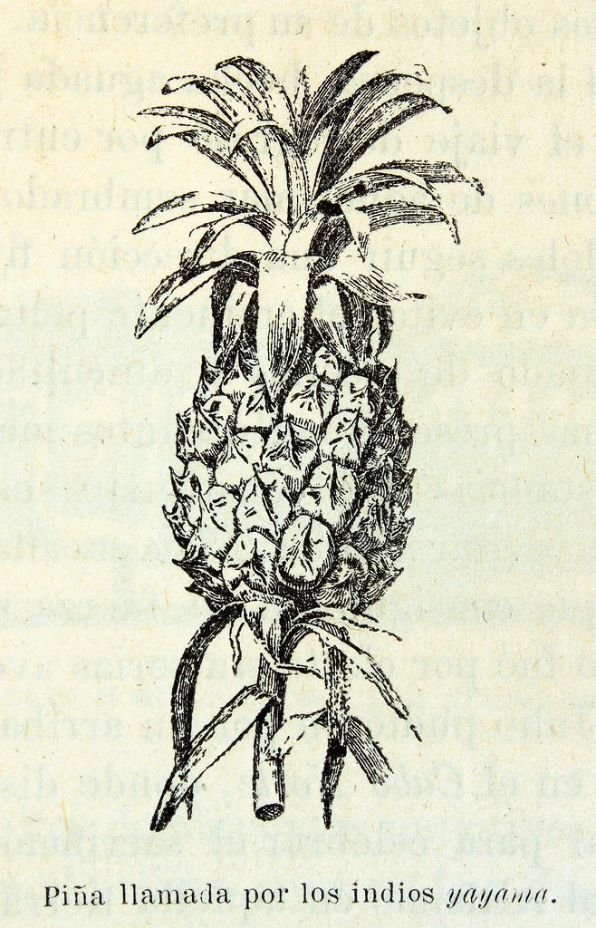
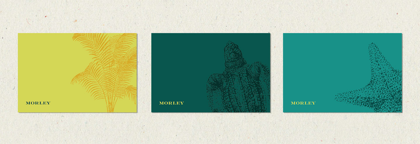
The pineapple featured prominently in Morley’s previous logo is known as an international symbol of hospitality — but we learned through our on-site discovery, that to locals, it’s synonymous with the Morley name.
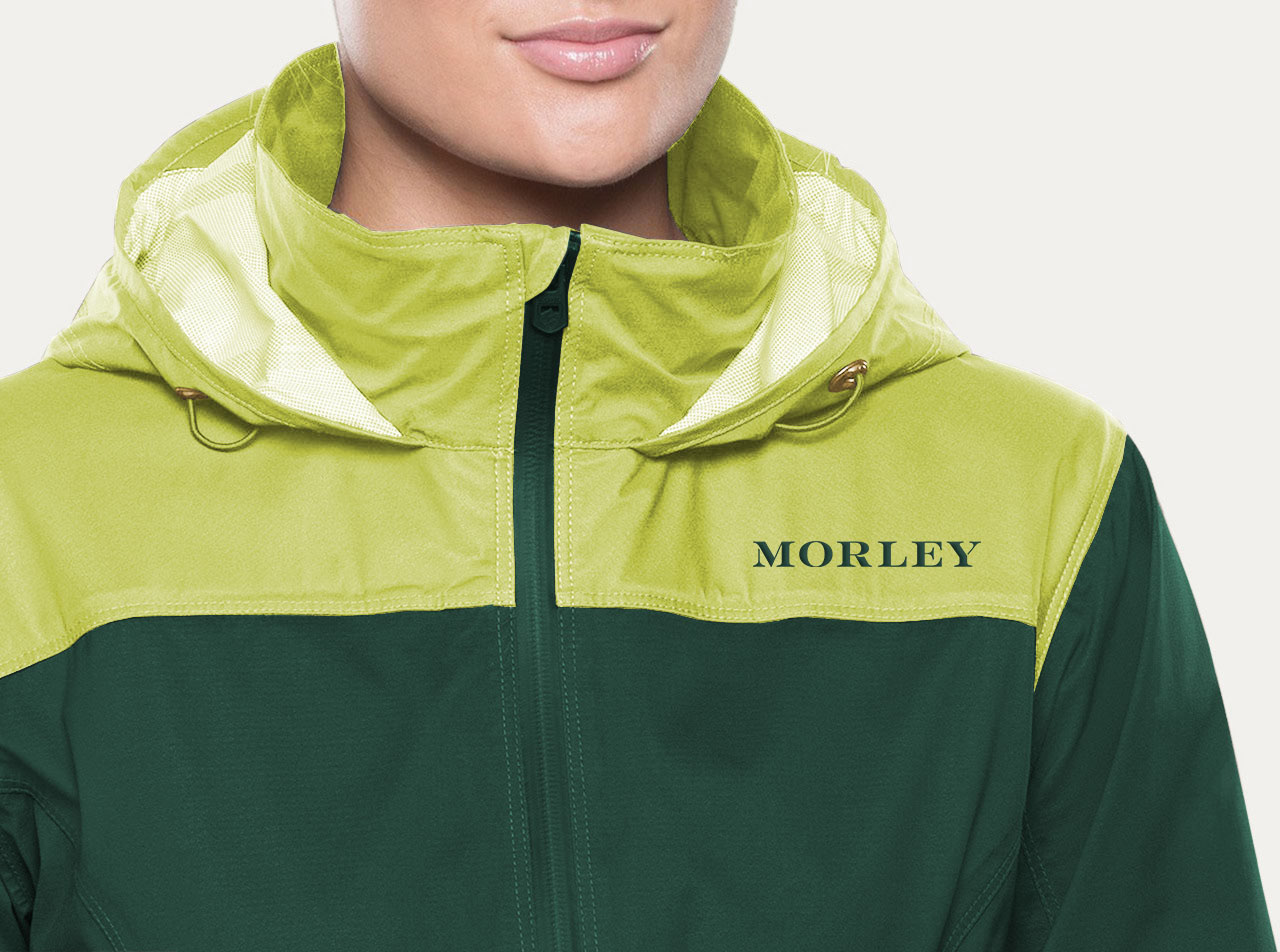
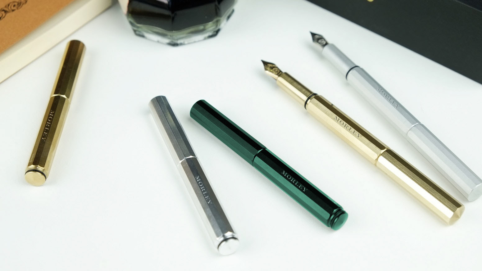
The fruit became the center of inspiration for the identity system I designed. I pulled structural elements from the pineapple husk and leaf to develop letterforms and a color palette that acknowledges the company’s history while creating a more contemporary profile.
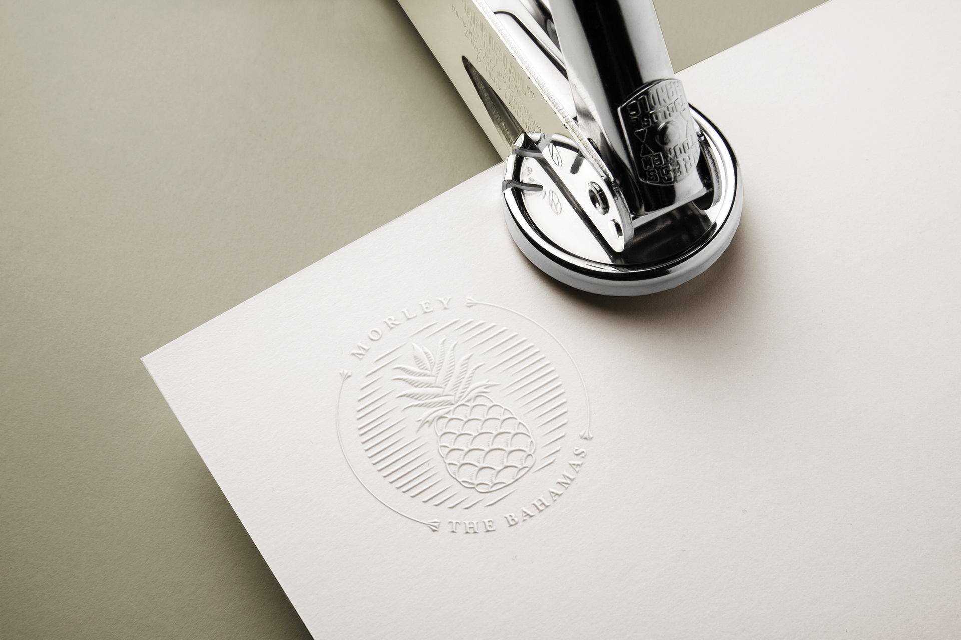
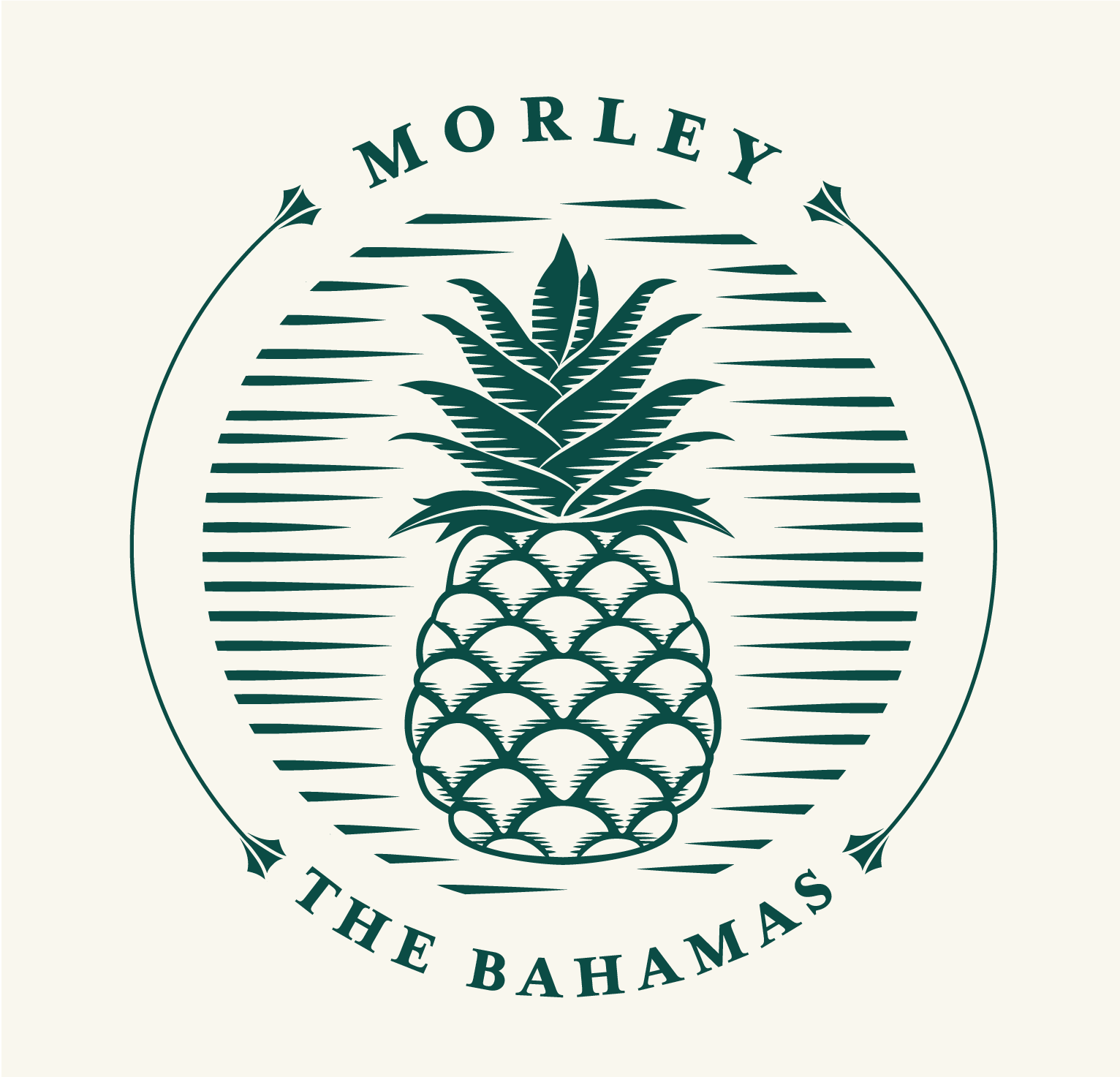
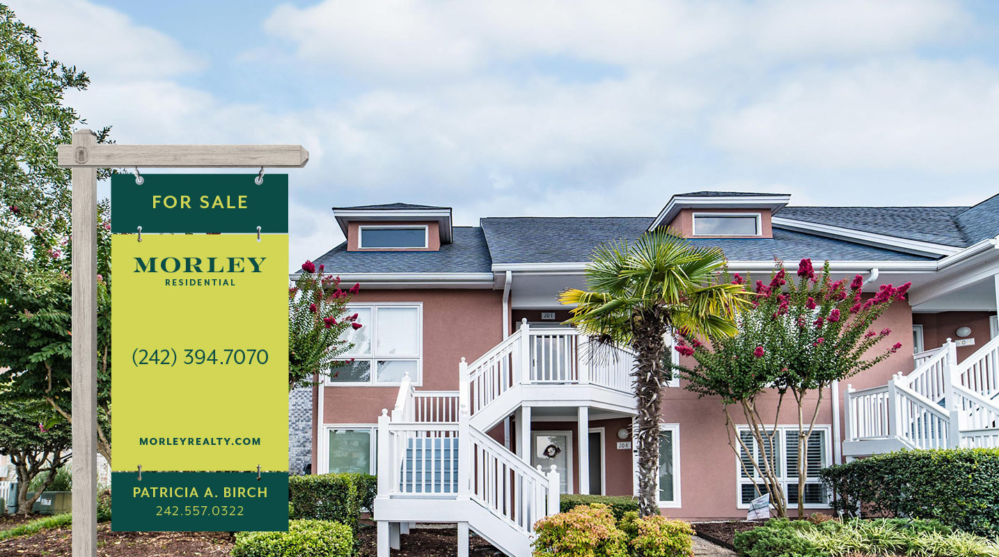
I removed the pineapple from the logo and instead designed a seal to pay homage to the symbolic nature of the pineapple and dial up the sophistication.
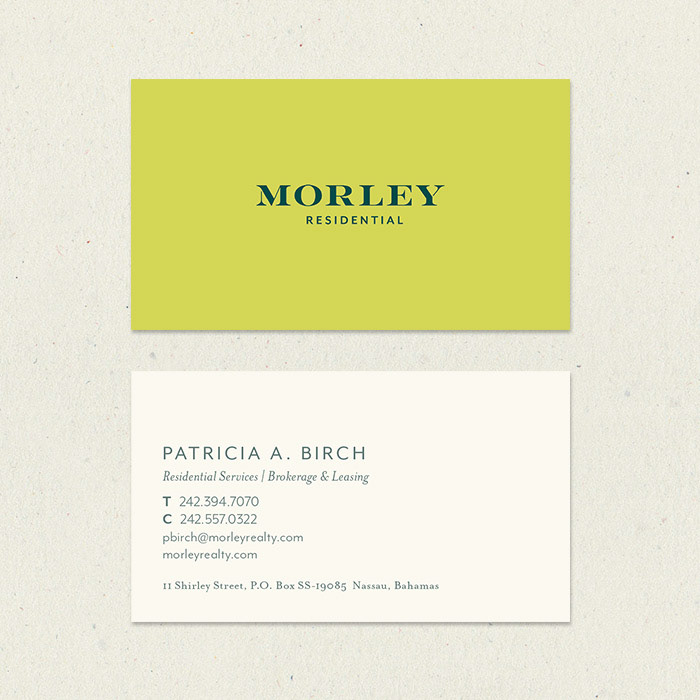
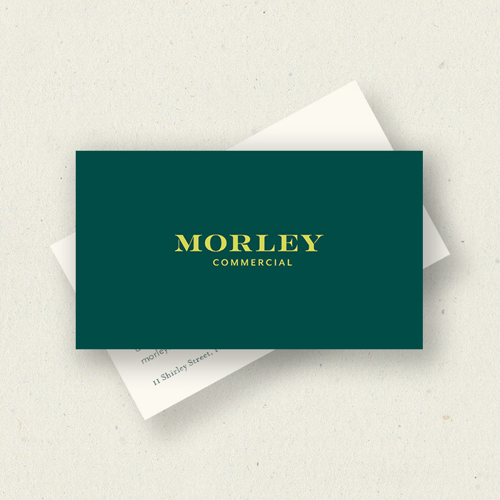
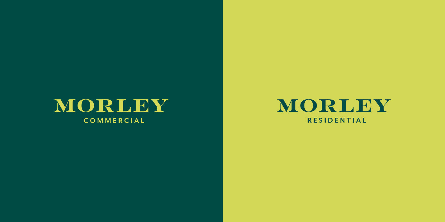
In terms of the company’s two distinct lines of business – commercial and residential brokerage and leasing services – I decided to use the color palette as a means of distinguishing the two. The commercial side of the business works directly with local and international industries, so we assigned them the more subdued emerald tone within the palette while the residential side of the business, which relies on more personal connections to their clients, was assigned the more vibrant citrine tone.
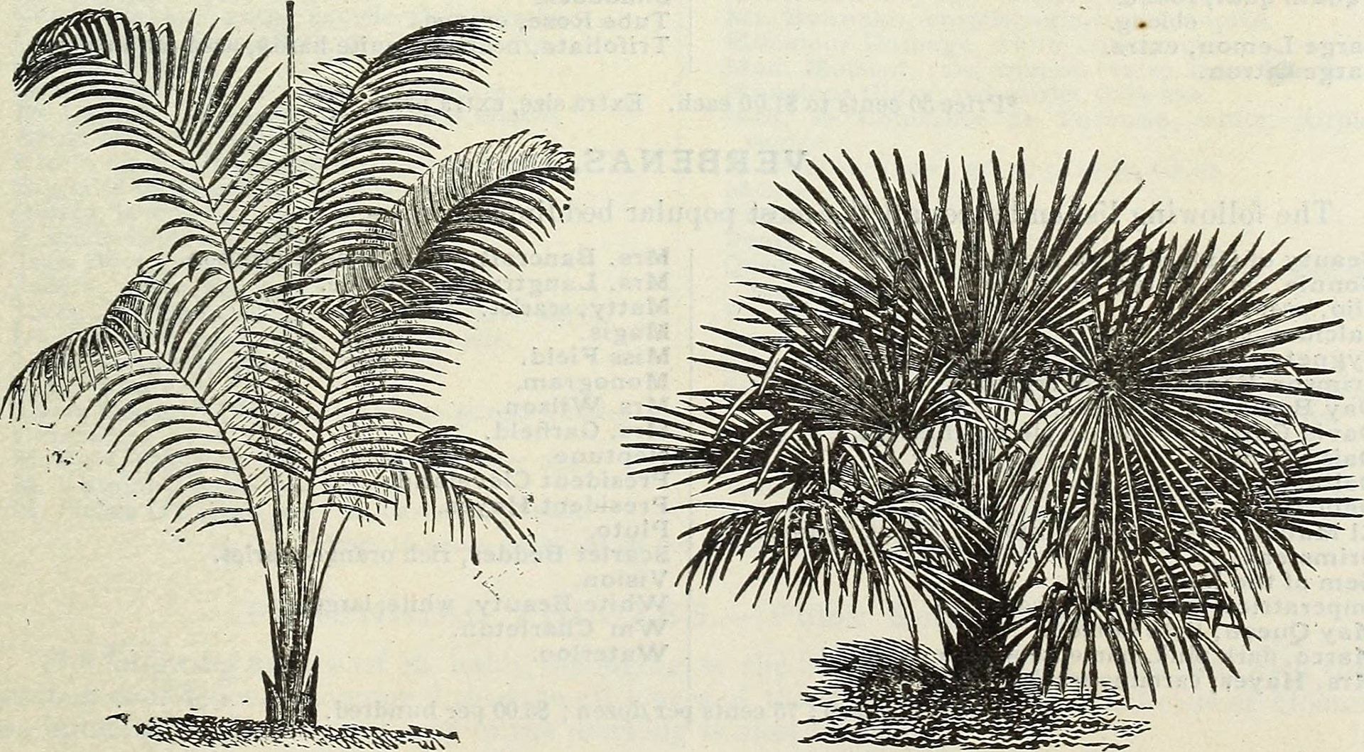
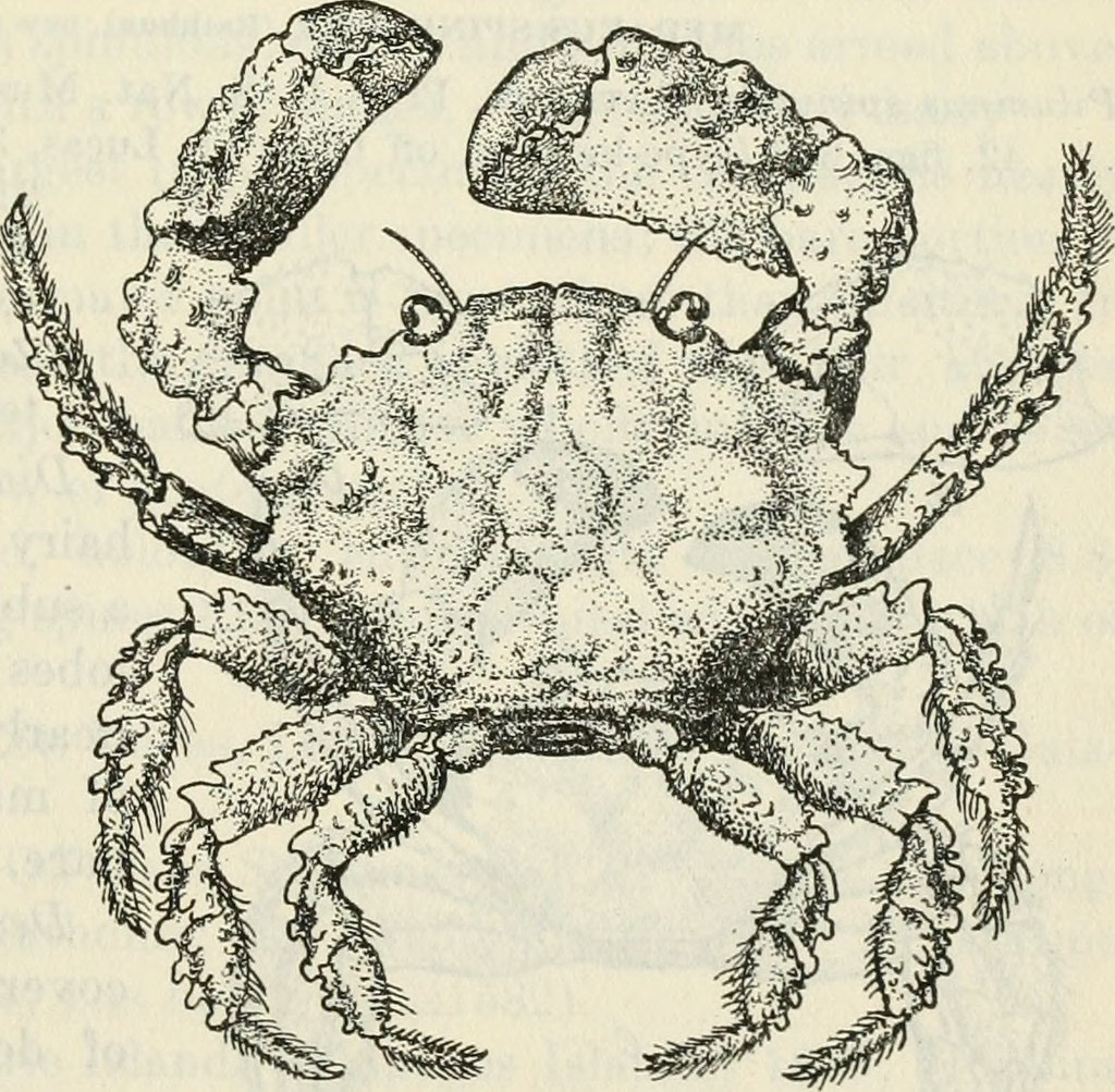
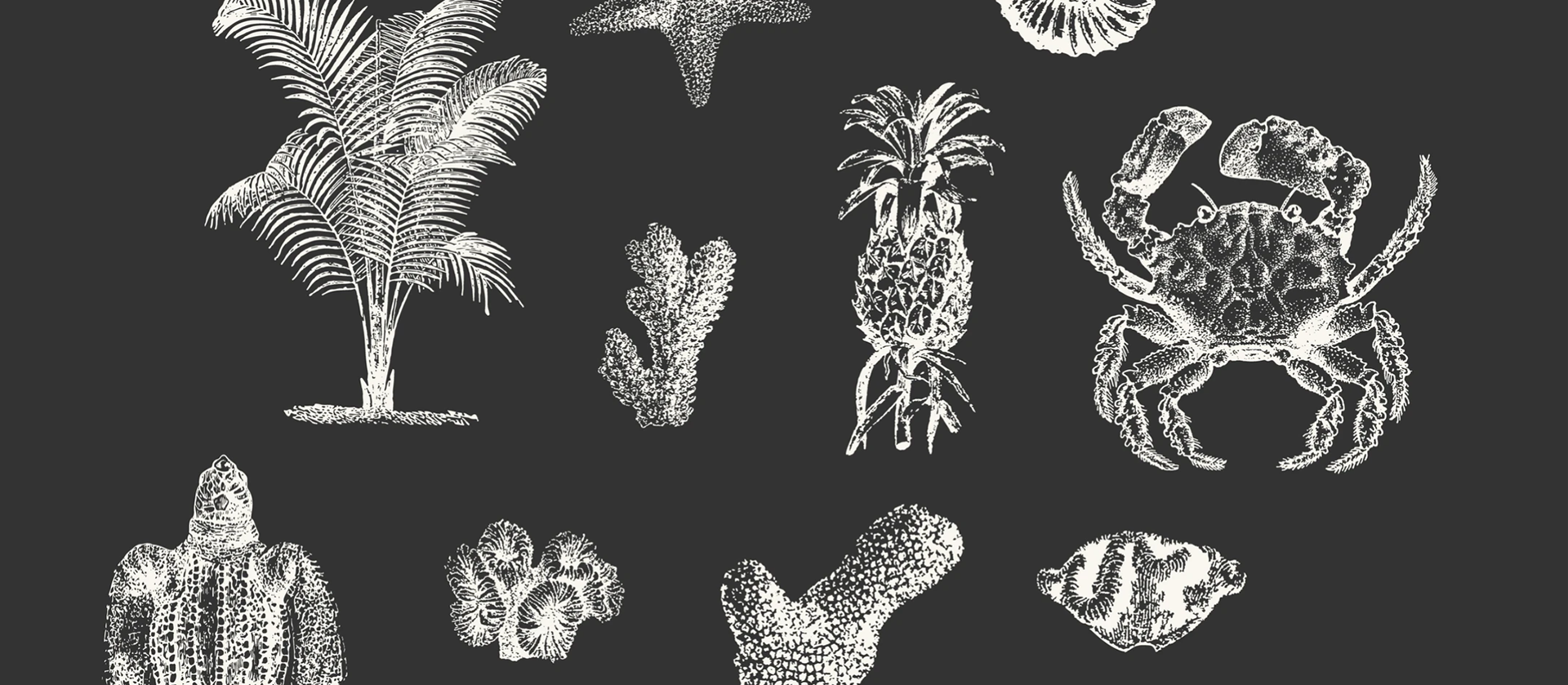
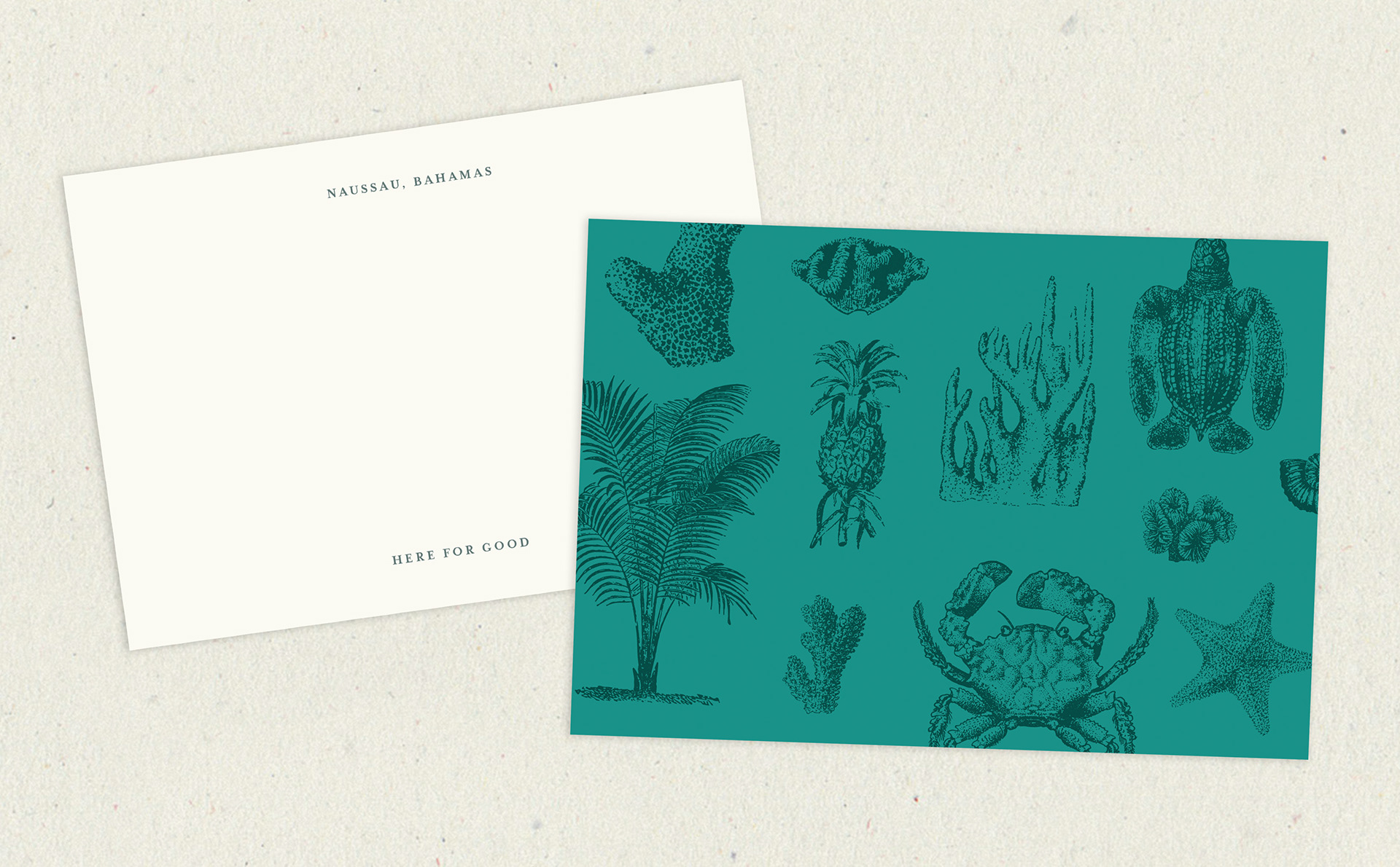
To further strengthen the brand’s connection to its locale I created a series of engravings based off historic Bahamian nature drawings. I combined the engravings together to form a pattern that brings a more playful side to Morley’s story of longevity and heritage.

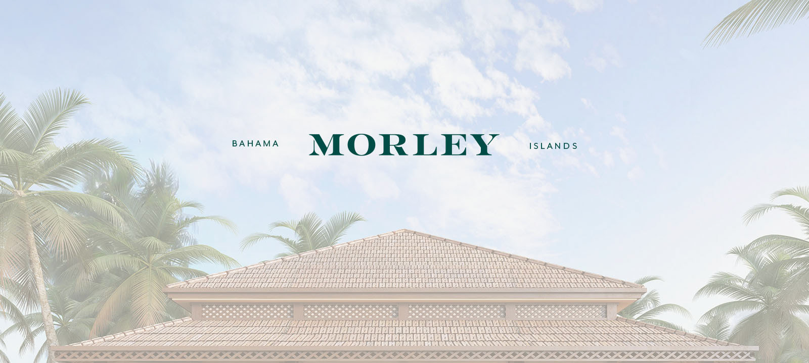
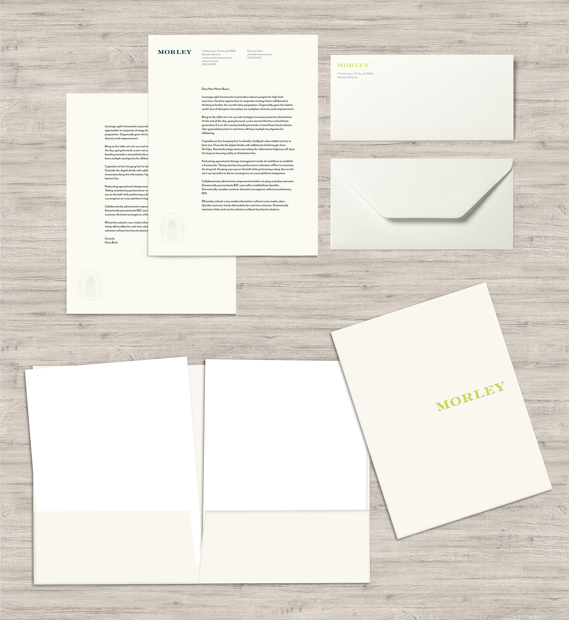
To bring the new brand story and visual identity to life, we wrote, designed and built a dedicated microsite. The microsite shares the Morley family's longstanding history in the Bahamas and showcase the new group of people behind the company that are making it what is it today.