
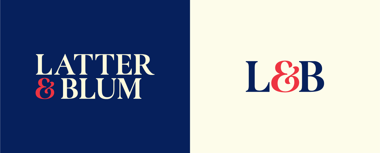
Latter & Blum
always building.
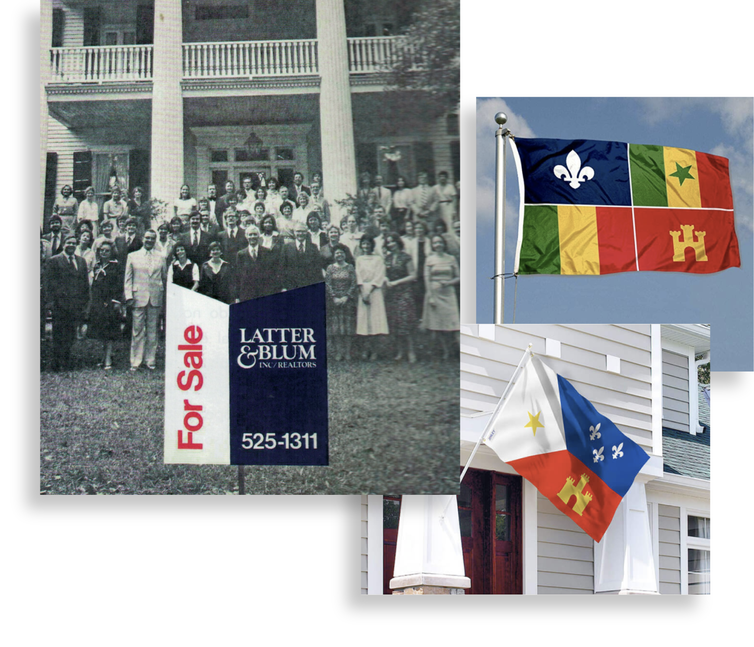
Latter & Blum was founded in 1916. The Merrick family bought the firm in 1986 and subsequently acquired other, smaller, brokerages across the state of Louisiana. As a part of the 1000watt team, I supported the project to help unify these companies under one brand.
c r e d I t
Creative Agency: 1000watt | Creative Direction: Patrick Sanders | Design: India Myers & North Bryan | Strategy: Joel Burslem | Writing: Larry Werner
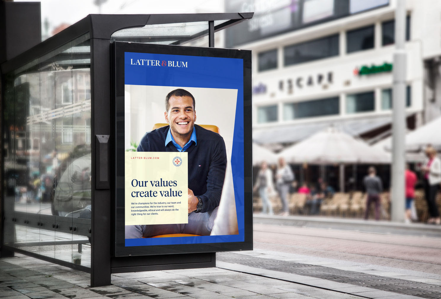
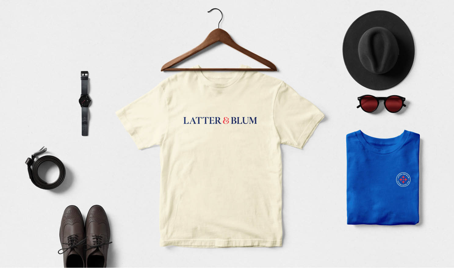
Louisiana is rich in culture, diversity and regional pride. I worked with 1000watt to develop an identity system for Latter & Blum that was as bold and vibrant as the people it would represent while still maintaining a classic, chic, and approachable profile.
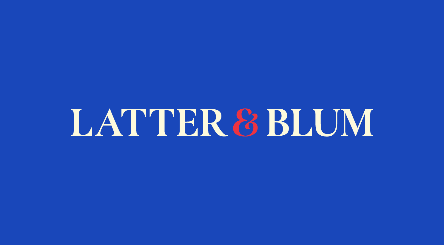
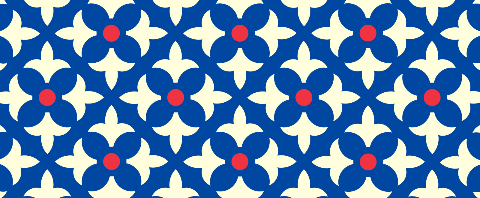
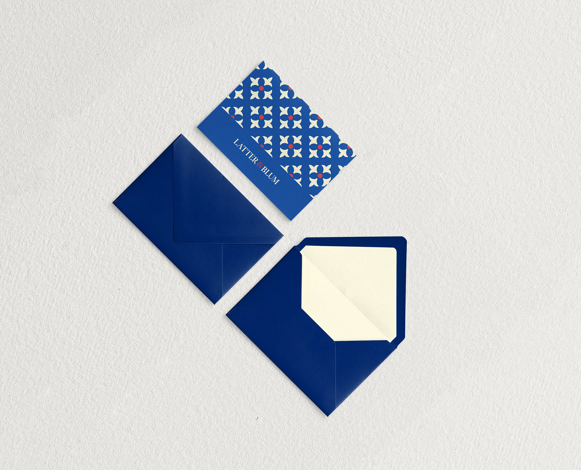
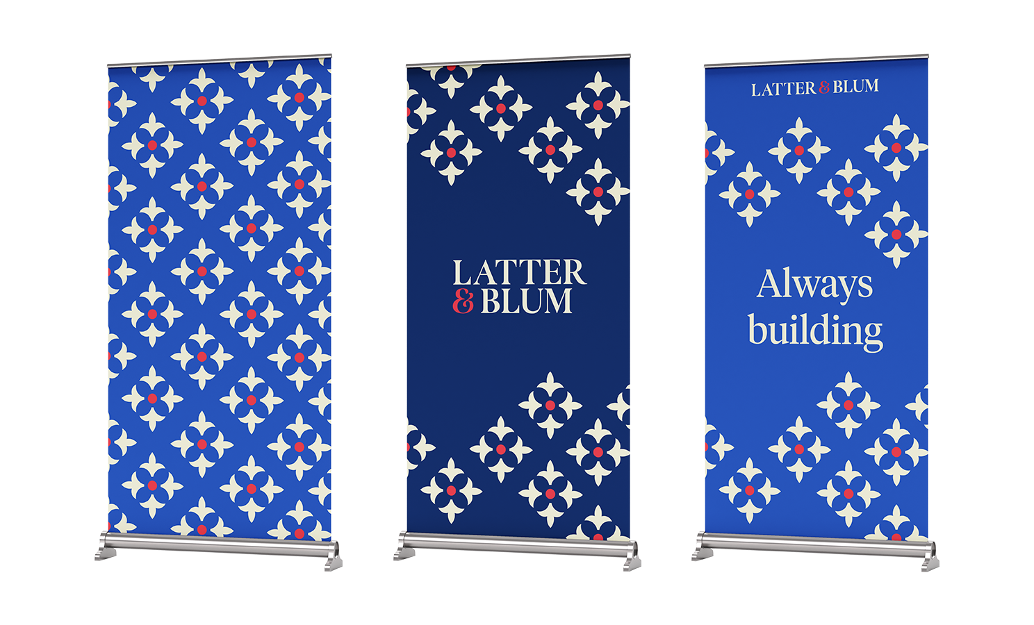
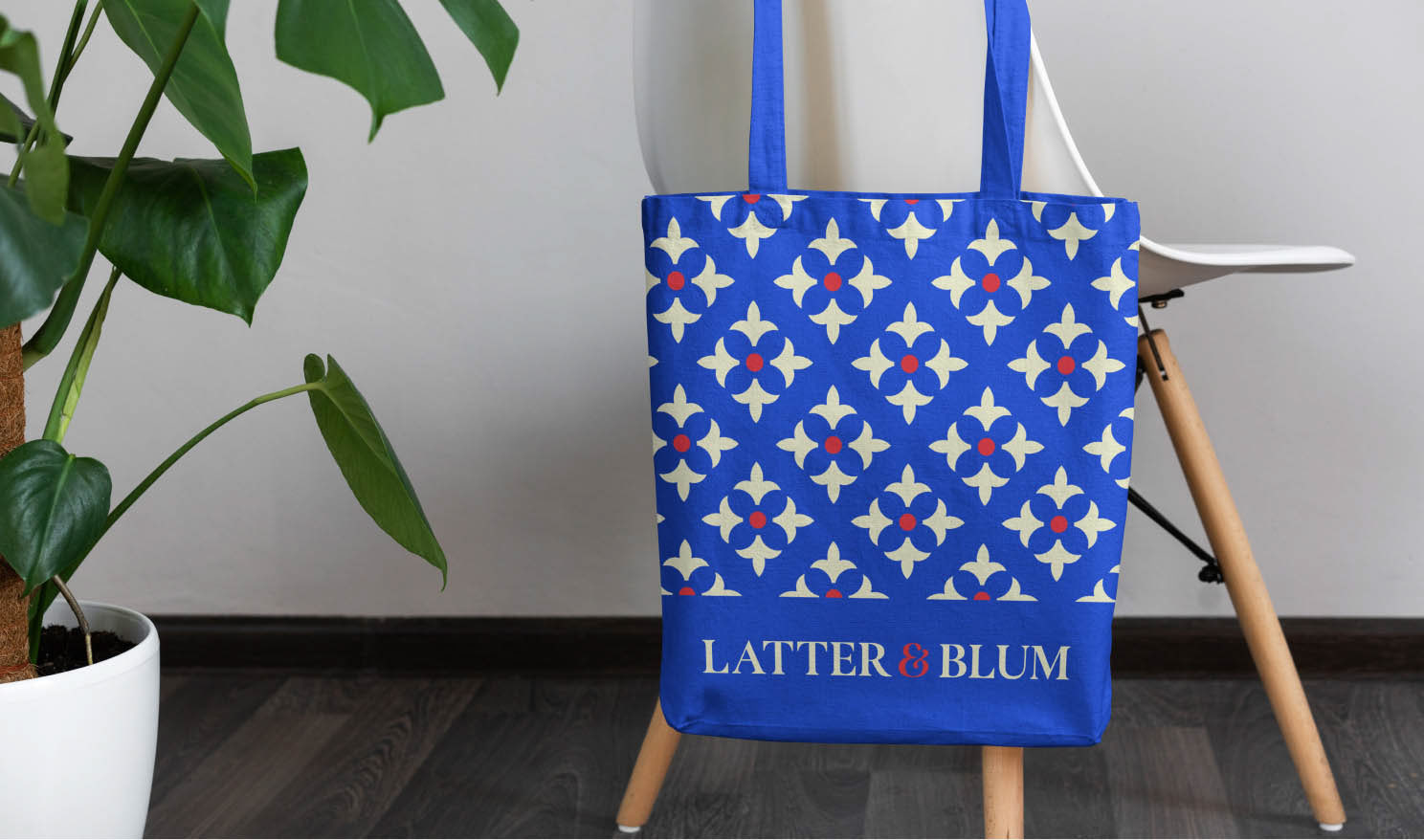
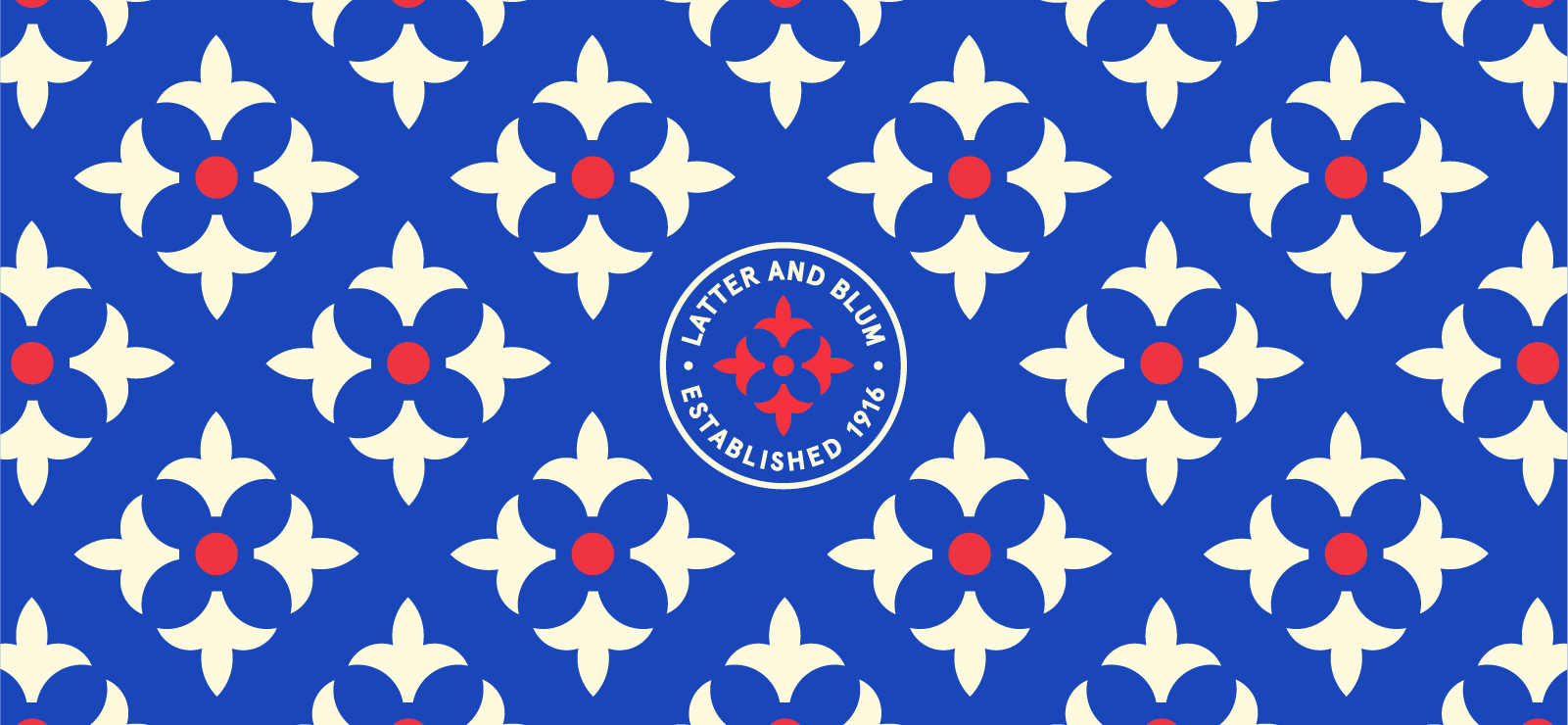
I drew inspiration from the regional flags we saw as we traversed the state and historical elements from previous iterations of the Latter & Blum branding to develop our core 3x3 grid system and updated the color palette the original Latter & Blum color palette from traditional to electric. I transitioned their primary navy into a striking cobalt; pulling inspiration from blue and white china, fired up their original red, and warmed the stark white to a soft cream.

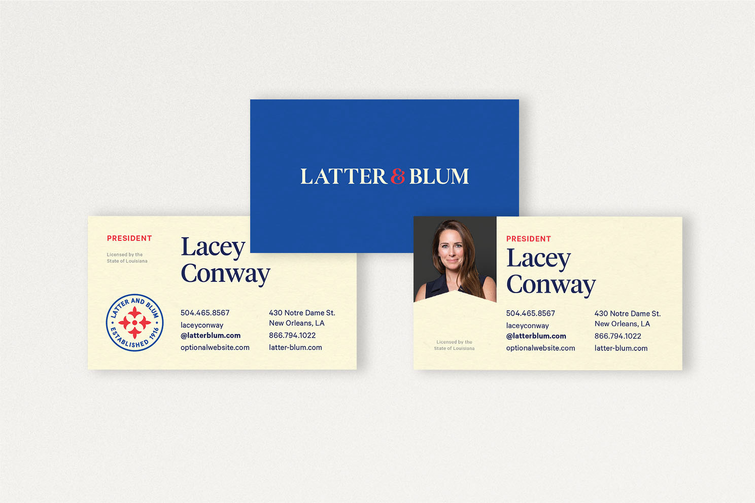
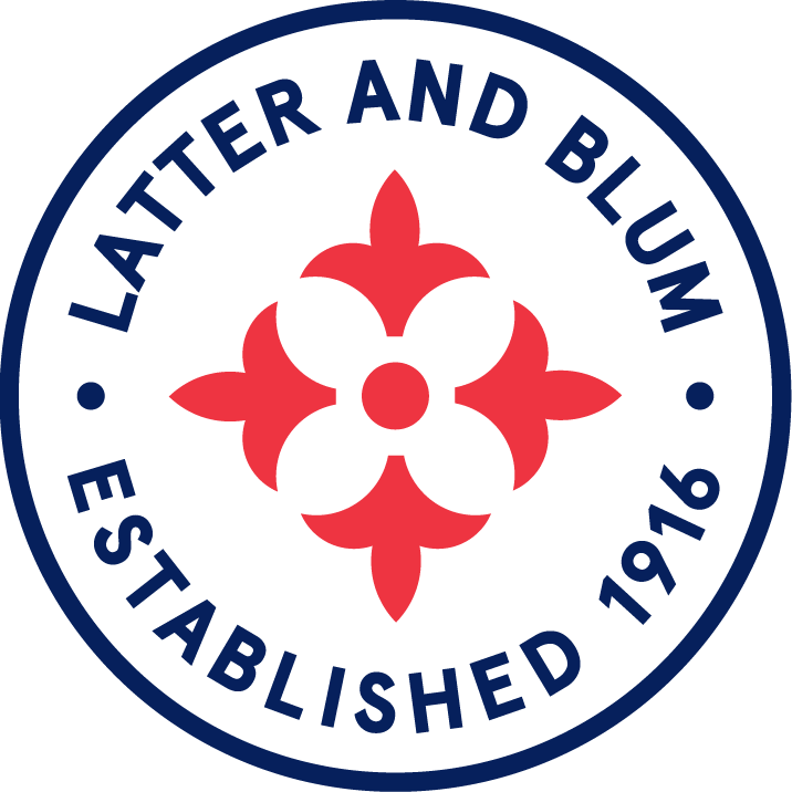
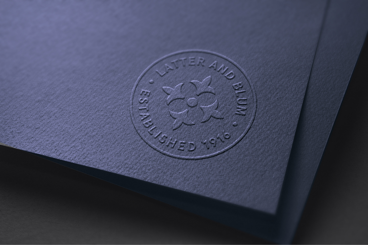
Latter & Blum calls itself a “family of families.” There is a sense of constantly pushing forward, adding to what is, and creating new opportunities. To honor the company’s history and its’ commitment to its future, we re-interpreted the fleur-de-lis we saw throughout New Orleans to create a company seal, naming it the “fluer-de-plu”; fleur-de-lis+.
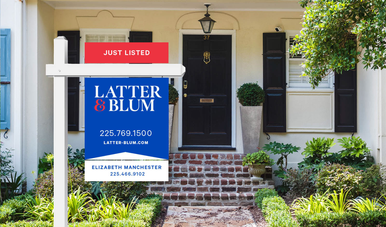
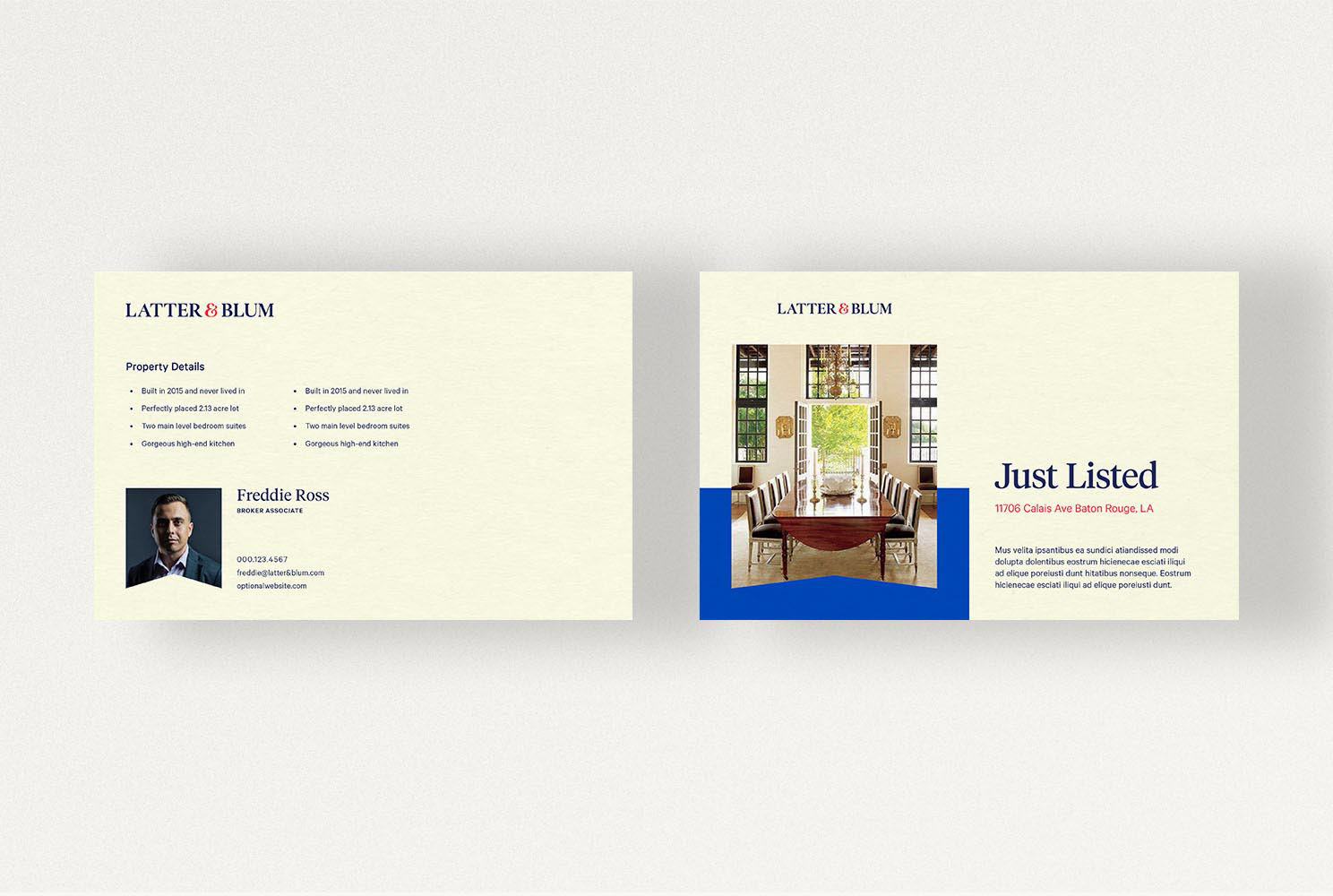
To further highlight Latter & Blum’s classic chic appeal I used the fluer-de-plu we developed to create elegant patterns reminiscent of Kate Spade and other luxury brands. There are two version of the pattern: ordered and organic. The ordered pattern’s structure and repeatable nature makes it applicable for a wide variety of applications, but the organic pattern is more expressive and works as a visual representation of Latter & Blum’s new tagline “Always Building”.