
The Hasson Company
WHERE YOU WANT TO BE.
Hasson Company was at a crossroads. With a legendary founder, a strong market position, and top-producing agents, they could continue doing what had always worked. Or, they could acknowledge an increasingly competitive landscape and fortify their brand for the future. They chose the latter.
C R E D I T
Creative Agency: 1000watt | Creative Direction: Patrick Sanders | Design: India Myers | Strategy: Corina Allender | Writing: Darcy Walker


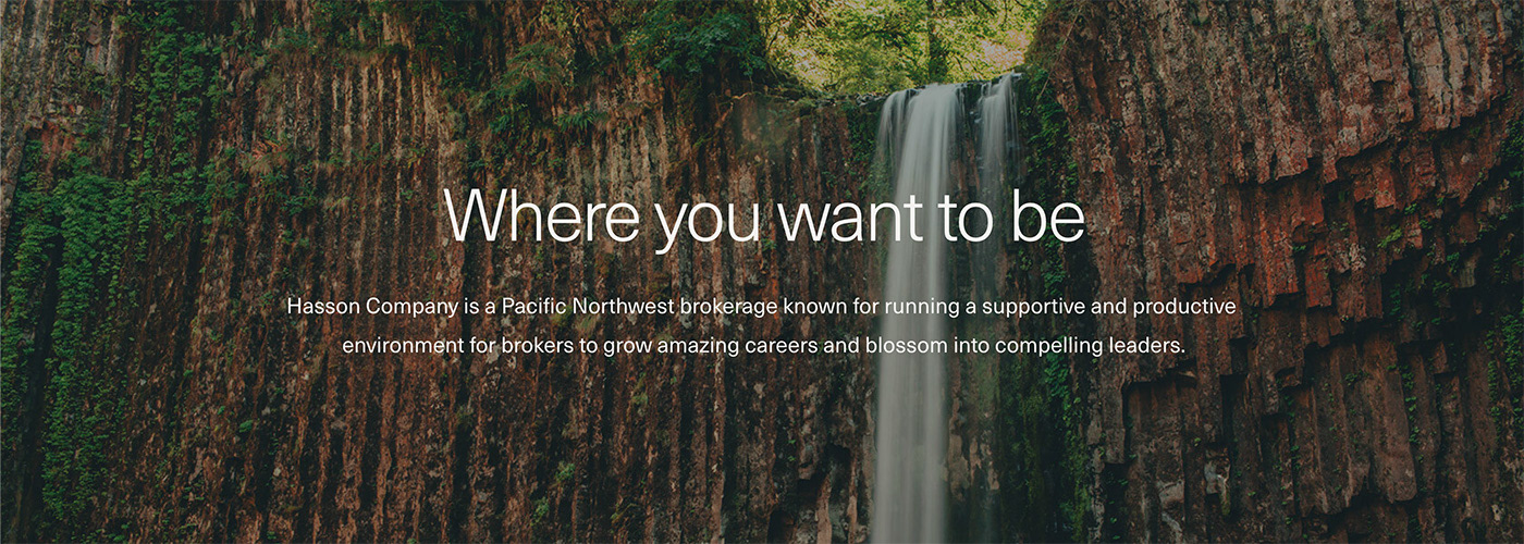
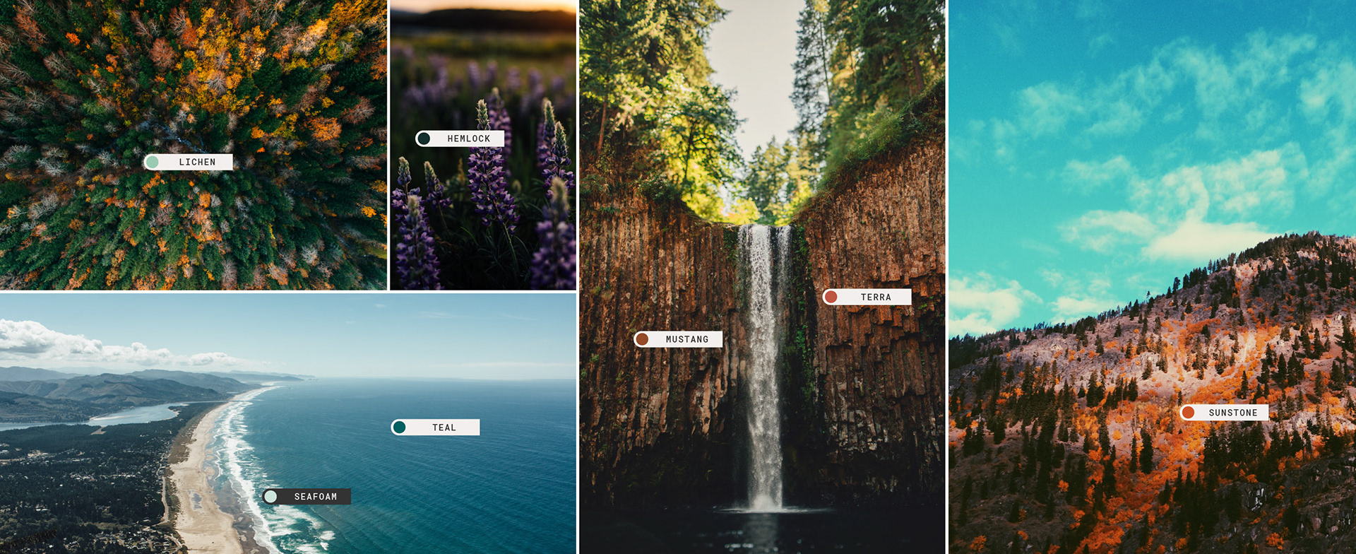
I worked with the creative director to create a visual approach for Hasson anchored in the idea that the brand should act as a mirror to the Pacific Northwest; reflecting the beautiful contrasts that exist here. From coastal landscapes and high desert vistas to suburban and urban environments, the brand needed to exist in and reflect a diverse geography.
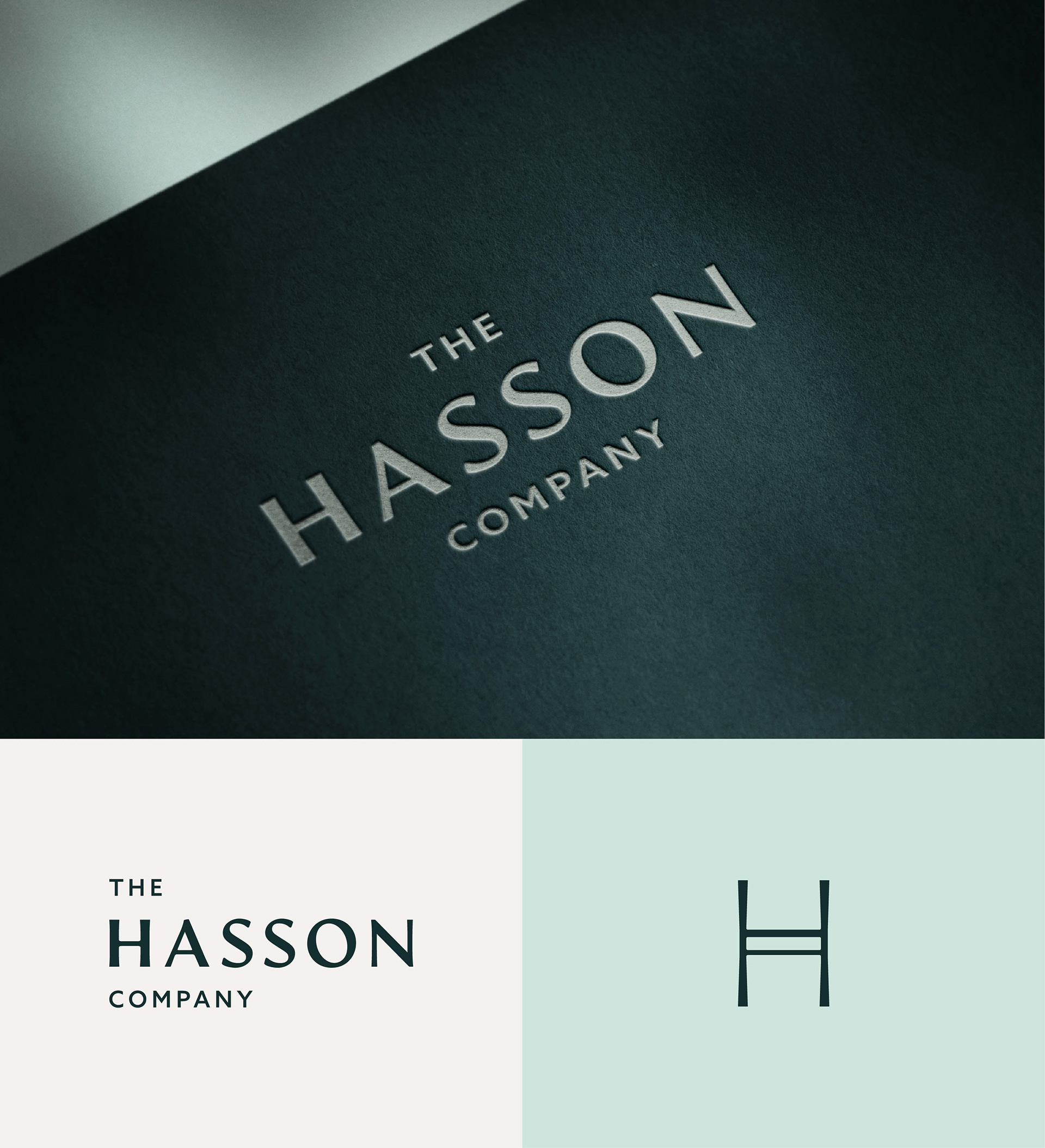
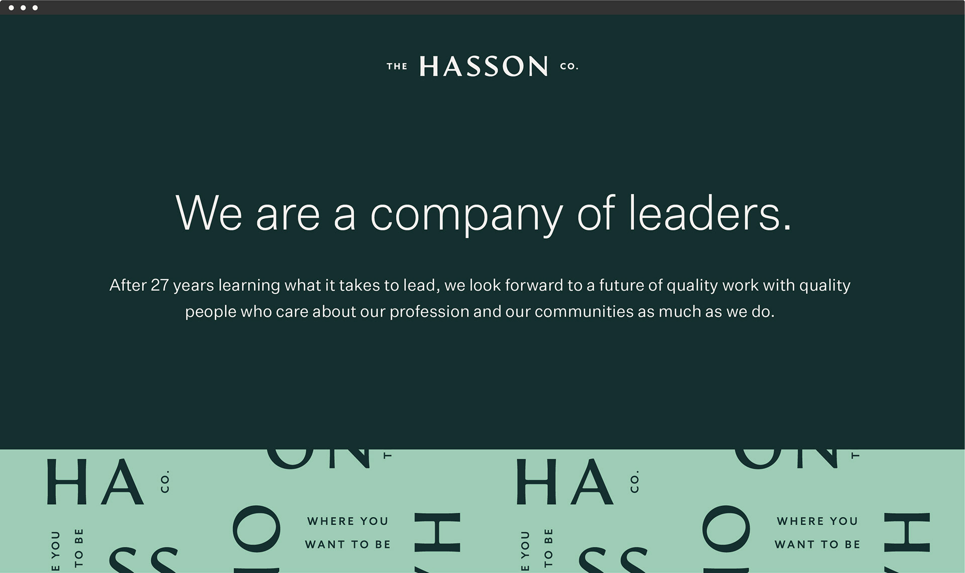
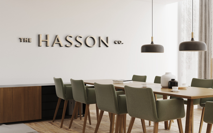
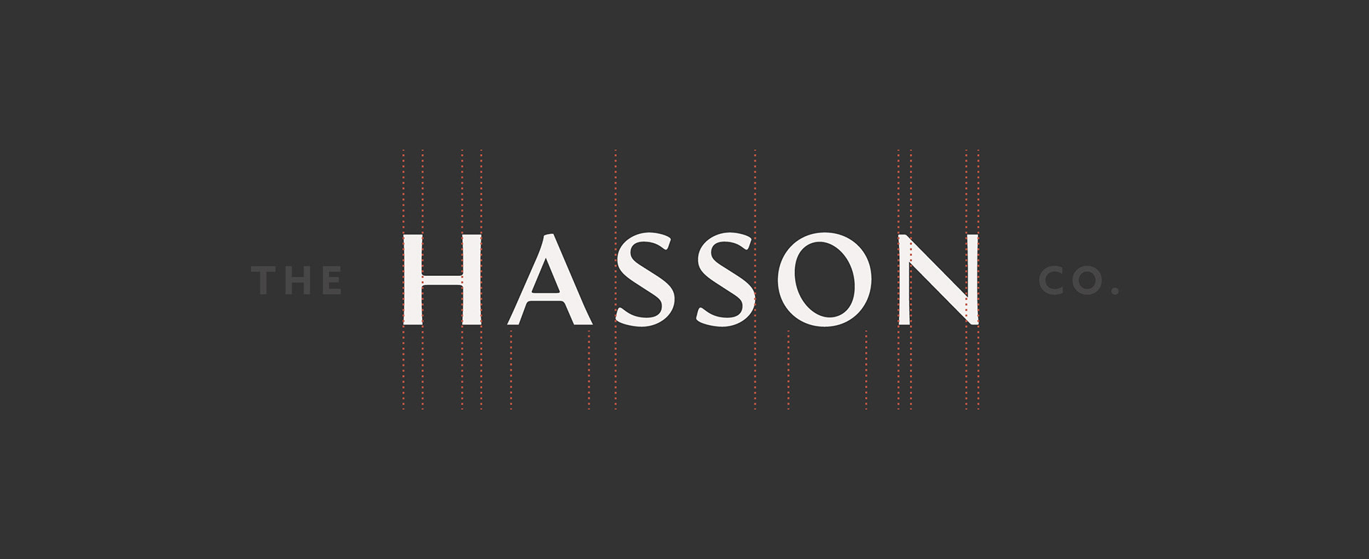
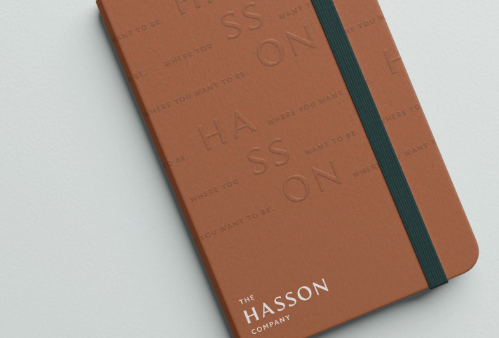
I redesigned the logo to create a bold visual hierarchy that placed emphasis on the name Hasson; highlighting the legacy of Mike Hasson, the company's founder, and how his values crafted the brand into what it is today. This hierarchy also makes the logo feel more dynamic and active.
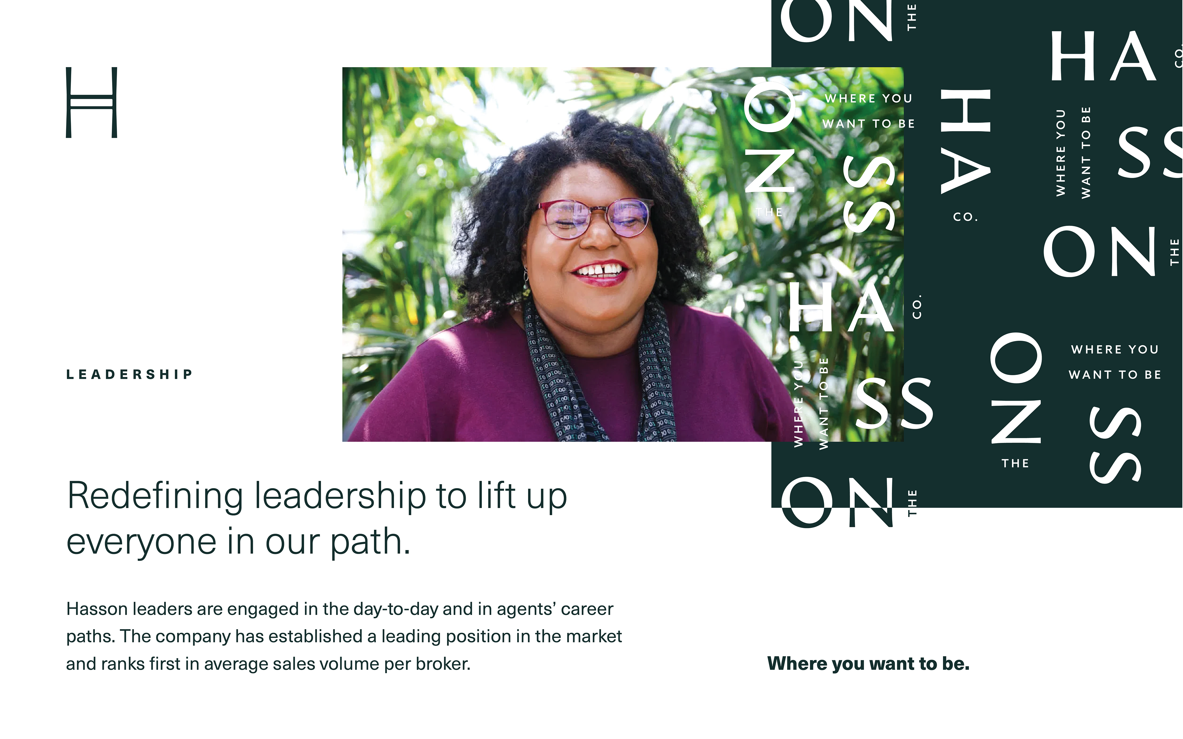
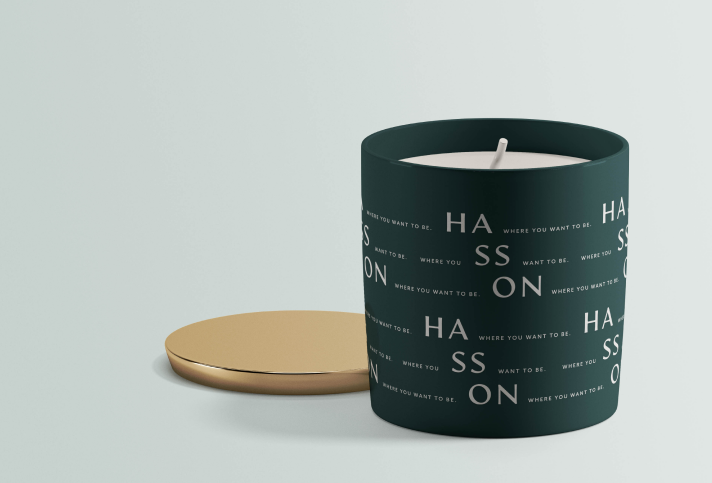
I also crafted a brand glyph inspired by the ‘H’ letterform. This brand glyph acts as a vessel for the Hasson promise and vision, carrying with it the thoughtfulness and intention the company has for its brokers and employees.


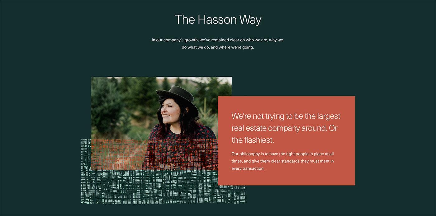
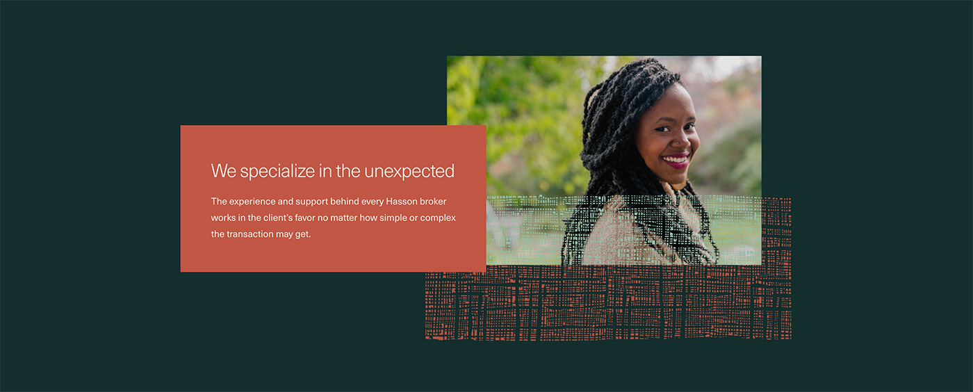
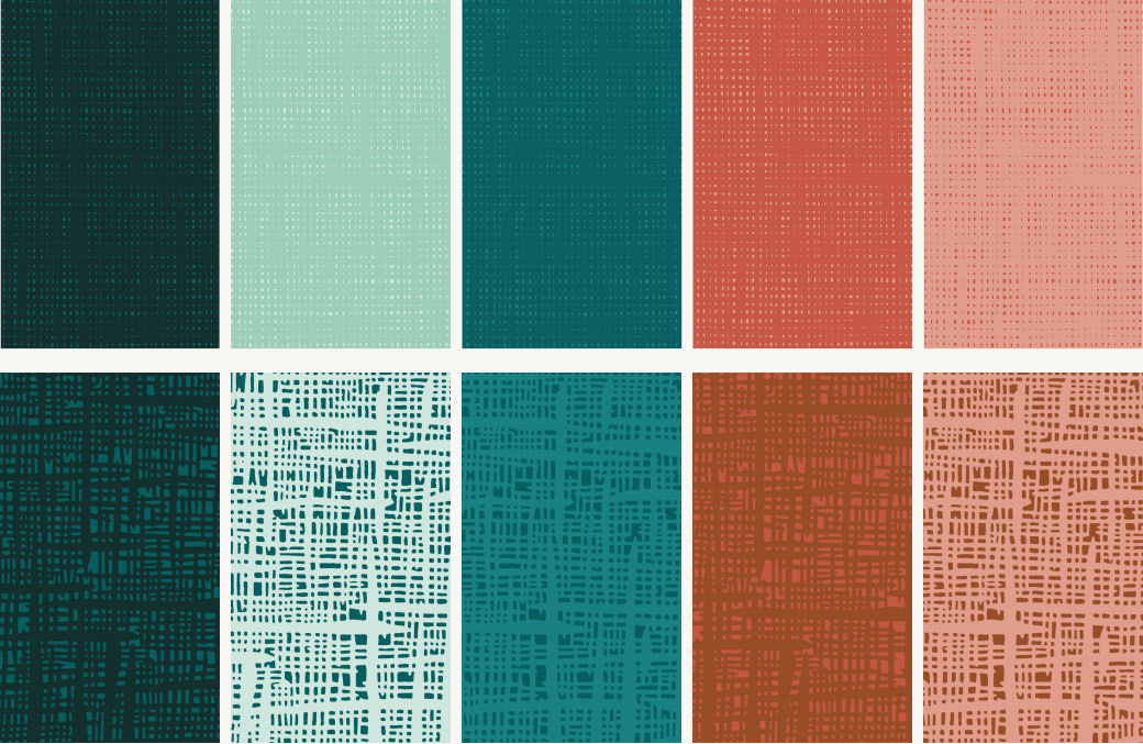
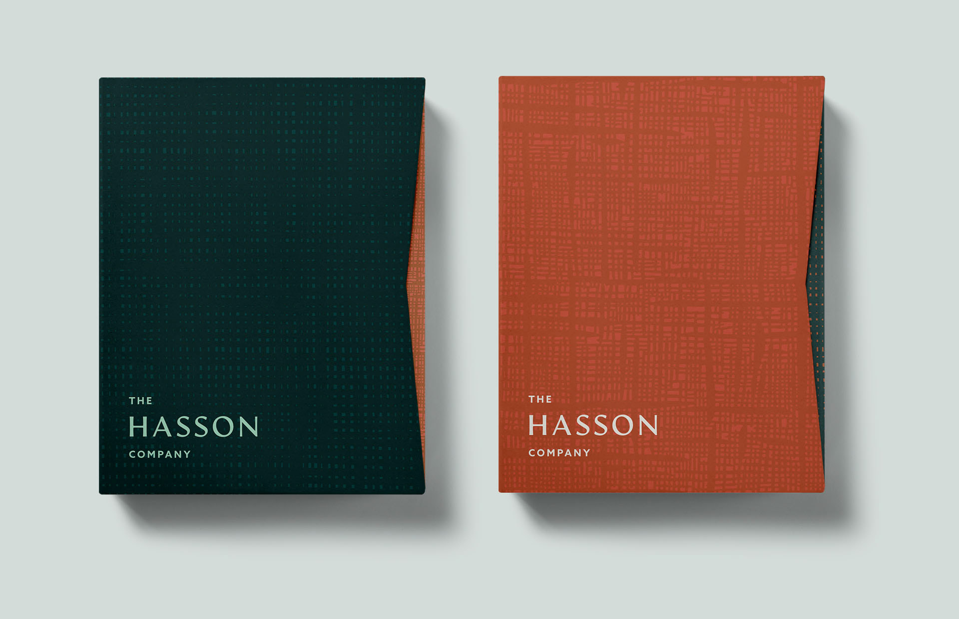
The visual elements I developed for Hasson’s identity were inspired by the hues and textures of the natural environment in the Pacific Northwest. Each color in the palette is pulled from a geological feature or area in the region, culminating in an array of vibrant green tones that are activated by warmer, earthier colors.
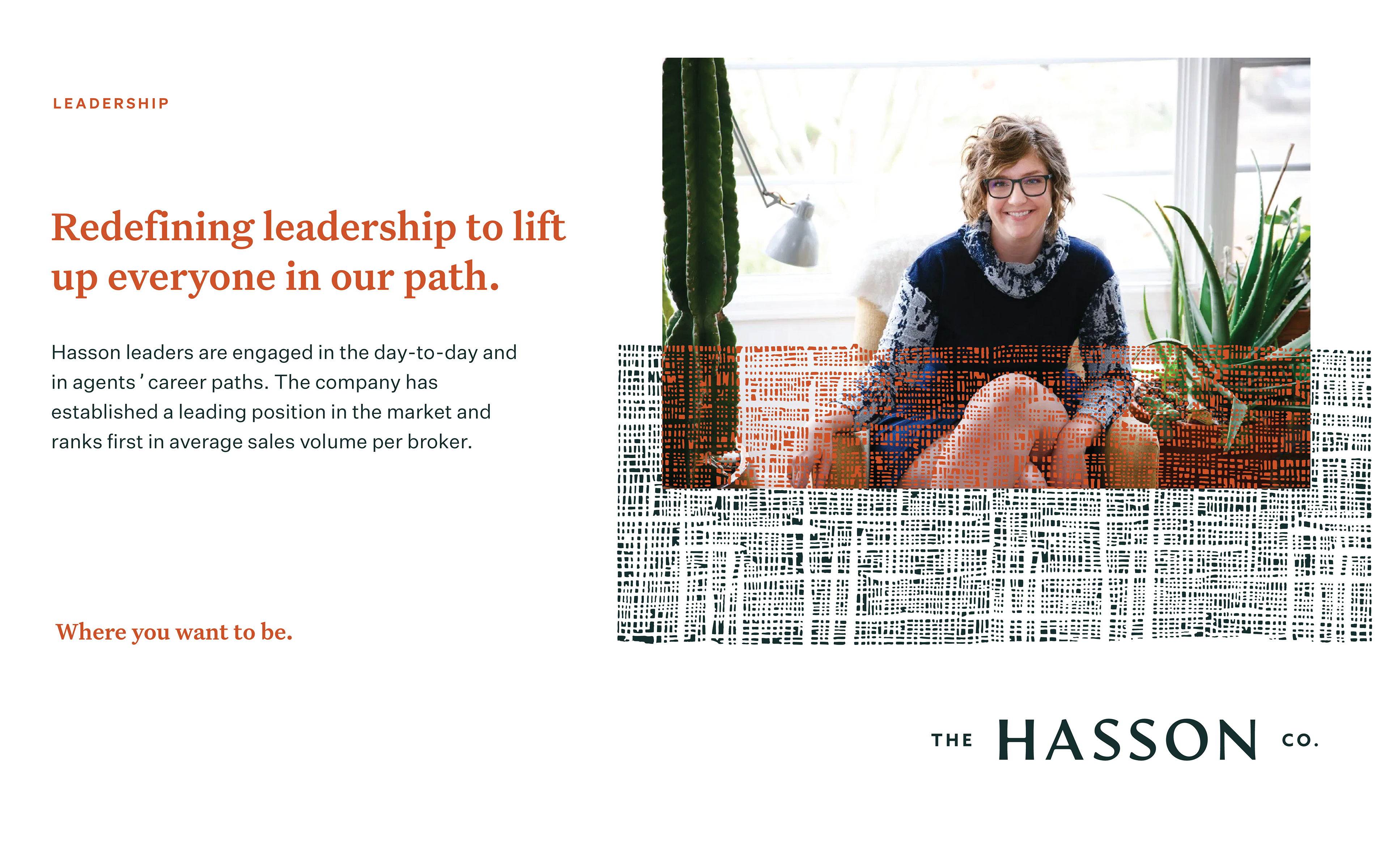
The natural, woven textures found in the system add a more handcrafted touch to the brand.
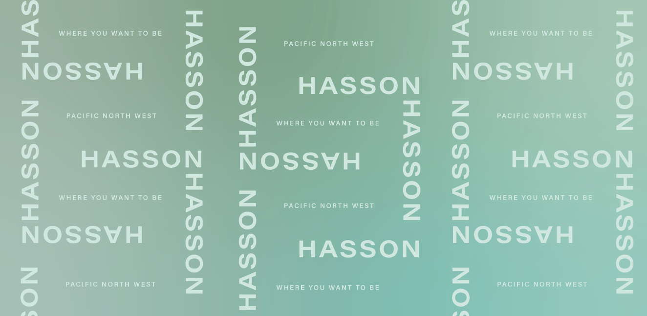
As we began our design process we noticed that the Hasson name had a beautifully balanced symmetry. Bookended by the two, strong vertical lines that make up the "H" and "N," the openness of the "A" and "O," and the repetition of the double "S's". I used this inherent balance within the Hasson name to develop typographic patterns. The patterns were built using both the company name and the tagline to further amplify the importance the founder has had on the company and its culture.

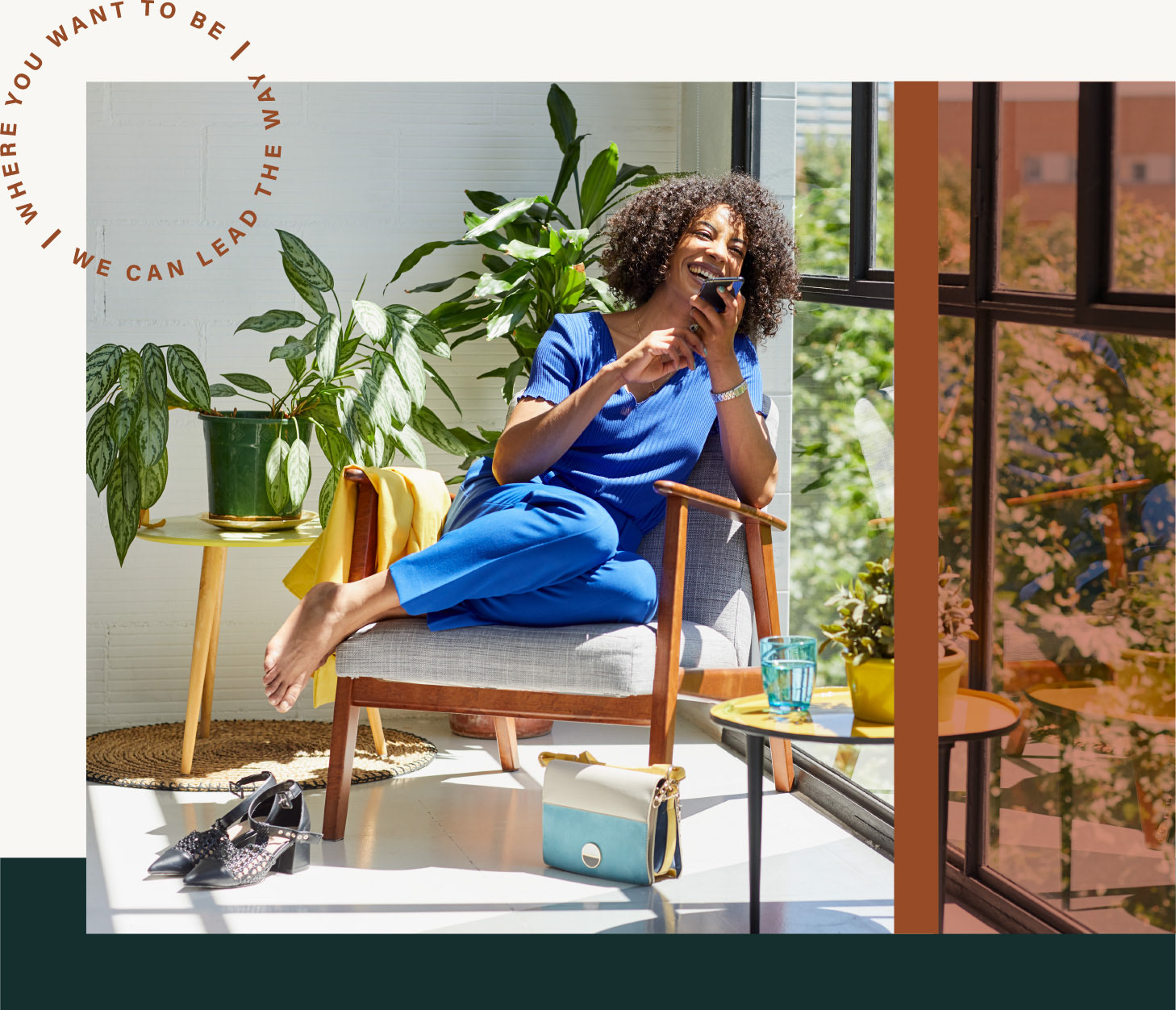
The new direction for the brand hinged on the dual slogan and tagline “Where you want to be/ We can lead the way” which re-asserts Hasson’s position as the premier destination for sophisticated, accomplished brokers, and reassures clients of the company’s rigorous commitment to ensuring quality at every turn. I created a lockup for the tagline/slogan at act as a stamp to carry Hasson’s message.
We helped Hasson announce the rebrand to its agents in a way that would maximize impact and excitement. This included internal messaging and assets like a landing page highlighting the rebrand and story.